Javascript and SEO – Notes from Across the Web [2023]

SEO and Vue.JS Notes – I recently did some research on this for a new website we’re building. I thought it’s worth a post for future reference and for anyone interested!

Summary

  • 90% of what I’ve found suggests you need to use Server-side or pre-rendering Javascript
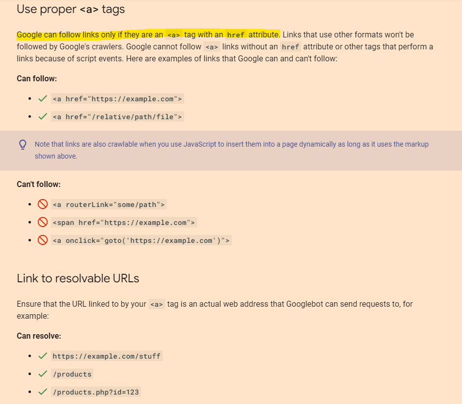
  • Make sure all links are available in the proper a href HTML markup in the “View Source” of page
  • Official Google Video

If a website requires JS to show links, then Googlebot has to add an extra element to crawl them – “rendering” is required

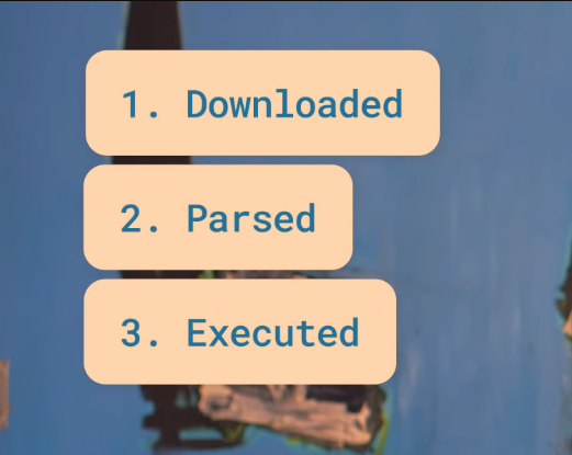
JS can be “costly” it needs to be downloaded, parsed and executed

  • Official Google Video

“Make sure the content you care about the most, is part of the markup you see in the source of your website”

– All of the homepage meta and all the links in the body render without JS and can be found in the “view source” code

  • Official Google Video

Mobile Friendly Test –

Shows the page-rendered source code

If code is missing, or page doesn’t render as expected, check the recommendations

Search Console

https://search.google.com/test/rich-results

“Google can crawl JS….Google may not necessarily fetch all the JS resources”

“Google won’t click or scroll”

“The main content and links won’t be visible to Google”

“The problem is rendering counts towards crawl budget”

– Could be a problem for big eCommerce stores with lots of pages

“Don’t block JS files in robots.txt”

“Problem when websites don’t use traditional ahref links”

Tools

https://chrome.google.com/webstore/detail/view-rendered-source/ejgngohbdedoabanmclafpkoogegdpob?hl=en

https://developers.google.com/search/docs/crawling-indexing/links-crawlable

Make your links crawlable

Google can follow your links only if they use proper <a> tags with resolvable URLs:

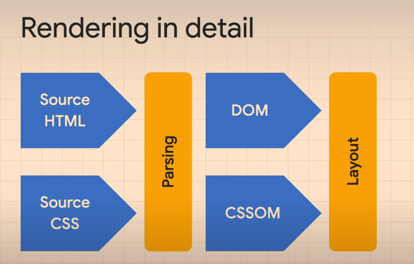
Render tree that creates the sizes, elements etc to display

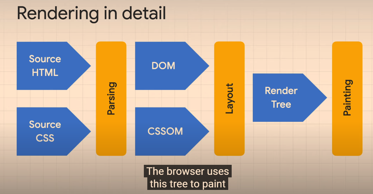
Finally, JS might add, change or remove tree elements – especially when interacting.

“View Source” – shows the Source HTML

Elements Tab in the Developer Tools shows current Dom content, including images etc added by JS

Search Console – Inspect URL – get rendered HTML that Google uses for indexing a page

https://itnext.io/yes-here-are-4-ways-to-handle-seo-with-vue-even-without-node-ssr-719f7d8b02bb

Not everyone can have a Node server for their project. And there may be a lot of reasons for that: shared webhost, no root access…

So here are 4 ways to handle SEO in 2021 with an SPA.

1. SEO on the client side with Google crawlers

React, Vue, Svelte… All these are frontend frameworks initially used to create SPAs, aka websites/webapps with CSR (Client Side Rendering).

What does this mean? It means the rendering is done in the browser. Therefore, the HTML sent to the browser & search engine crawlers is empty!

No HTML content = No SEO.

Remember, you need to handle SEO tags (title, meta…) on the client side! You can use vue-meta or vue-head for that (personally, I prefer vue-meta).

2. SEO with Node-based Server Side Rendering (SSR)

So SSR aka Sever Side Rendering, is a “new” concept that came with frontend frameworks. It’s based on Isomorphic programming which means the same app and code is executed on backend context and frontend context.

Because your app is executed on the backend, the server returns your component tree as an HTML string to the browser.

What does this mean? Since each initial request is done by a Node server that sends HTML, this even works for social media crawlers or any other crawler.

SSR with Vue can be done in 2 ways, DIY or with a framework on top of Vue:

Of course, SEO with Node-based SSR has it’s drawbacks:

You need… A Node server! Don’t worry, you only need it for the initial HTML rendering, not for your API.

3. SEO using “classic” Server Side Rendering (SSR)

So, based on what we learnt in 1 & 2, we can acheive something similar with a any backend language.

To solve this, we need to do 4 actions with any type of backend:

  1. Use a backend router that mirrors the frontend router, so that the initial response can render content based on the url asked
  2. In the backend response, we will only generate title & meta tags since our backend can’t execute frontend code
  3. We will store some initial data in a variable on the window object so that the SPA can access it at runtime on the client
  4. On the client, you check if there’s data on the window object. If there is, you have nothing to do. If there isn’t, you do a request to the API server.

That’s pretty much it for the backend, nothing more. You only need a single “view” file that takes title, meta, initialData or whatever parameters you need for SEO/SMO and that’s it.

The “window.initialData = @ json($state)” is also very important here, but not mandatory for SEO. It’s for performance/UX purposes. It’s just for you to have initial data in the frontend, to avoid an initial AJAX request to your API server.

Of course, SEO with classic SSR has it’s drawbacks:

  • You have to mirror each route were you need SEO on the backend
  • You have to pass “the same data” to the frontend and to APIs, sometimes if feels like duplicating stuff

4. JAMStack aka Static Site Generation aka Prerendering

This is my the method I love the most, but it isn’t meant for all situations.

So what is JAMStack? Well it’s a fancy word for something that existed before that we called: static websites.

So what’s JAMStack then? JavaScript API Markup.

JAMStack is the concept of prerendering, but automated and modernized.

It’s an architecture solely based on the fact that you will prerender markup with initial data, that markup would use JavaScript to bring interaction and eventually more data from APIs (yours and/or others).

In a JAMStack architecture, you would usually use a frontend framework to prerender your static files that would then turn to an SPA.

It’s mostly based on the fact that you would rebuild pages on-the-fly anytime data changes in your APIs, through webhooks with CI/CD.

So it’s really nice, but not great for websites/webapps that have daily updates with a lot of pages.

Why? Because all pages are regenerated each time.

It’s the fastest, most SEO-friendly and “cheapest” method.

You only need your API server, a static host (Netlify, Vercel, S3, Firebase Hosting, etc…), and a CI/CD system for rebuilds which you most likely already have to handle tests or deployment.

Prerendering tools

Any other SSG (static site generator) would be good but, you won’t have hydration with those not Vue-driven.

APIs: You can create your own API but, usually when you do JAMStack, it’s for content-drive websites/webapps. That’s why we often use what we call: Headless CMSs.

A headless CMS, is a CMS that can render HTTP APIs as a response.

There are many of them: Strapi, Directus (Node), WordPress (yep it can), Cockpit CMS (PHP), Contentful, Dato, Prismic (hosted)…

You can find more here: https://jamstack.org/headless-cms

Conclusion: What’s the best SEO method then?

There isn’t a silver bullet. It depends on your stack, budget, team, type of app and some other parameters.

In a nutshell, I would say:

  • If you don’t care a lot about it: an optimized SPA with Vue meta is fine
  • If you can use Node: do Node-based SSR
  • If you can’t use Node: do classic SSR with initial data rendering
  • If you don’t have daily page updates or too many pages: JAMStack

That’s it. Remember: there’s never ONLY ONE WAY to do something.

https://www.smashingmagazine.com/2019/05/vue-js-seo-reactive-websites-search-engines-bots/

These frameworks allow one to achieve new, previously-unthinkable things on a website or app, but how do they perform in terms of SEO? Do the pages that have been created with these frameworks get indexed by Google? Since with these frameworks all — or most — of the page rendering gets done in JavaScript (and the HTML that gets downloaded by bots is mostly empty), it seems that they’re a no-go if you want your websites to be indexed in search engines or even parsed by bots in general.

This seems to imply that we don’t have to worry about providing Google with server-side rendered HTML anymore. However, we see all sorts of tools for server-side rendering and pre-rendering made available for JavaScript frameworks, it seems this is not the case. Also, when dealing with SEO agencies on big projects, pre-rendering seems to be considered mandatory. How come?

COMPETITIVE SEO #

Okay, so the content gets indexed, but what this experiment doesn’t tell us is: will the content be ranked competitively? Will Google prefer a website with static content to a dynamically-generated website? This is not an easy question to answer.

From my experience, I can tell that dynamically-generated content can rank in the top positions of the SERPS. I’ve worked on the website for a new model of a major car company, launching a new website with a new third-level domain. The site was fully generated with Vue.js — with very little content in the static HTML besides <title> tags and meta descriptions.

WHAT ABOUT PRE-RENDERING? #

So, why all the fuss about pre-rendering — be it done server-side or at project compilation time? Is it really necessary? Although some frameworks, like Nuxt, make it much easier to perform, it is still no picnic, so the choice whether to set it up or not is not a light one.

I think it is not compulsory. It is certainly a requirement if a lot of the content you want to get indexed by Google comes from external web service and is not immediately available at rendering time, and might — in some unfortunate cases — not be available at all due to, for example, web service downtime. If during Googlebot’s visits some of your content arrives too slowly, then it might not be indexed. If Googlebot indexes your page exactly at a moment in which you are performing maintenance on your web services, it might not index any dynamic content at all.

Furthermore, I have no proof of ranking differences between static content and dynamically-generated content. That might require another experiment. I think that it is very likely that, if content comes from external web service and does not load immediately, it might impact on Google’s perception of your site’s performance, which is a very important factor for ranking.

JAVASCRIPT ERRORS #

If you rely on Googlebot executing your JavaScript to render vital content, then major JavaScript errors which could prevent the content from rendering must be avoided at all costs. While bots might parse and index HTML which is not perfectly valid (although it is always preferable to have valid HTML on any site!), if there is a JavaScript error that prevents the loading of some content, then there is no way Google will index that content.

OTHER SEARCH ENGINES #

The other search engines do not work as well as Google with dynamic content. Bing does not seem to index dynamic content at all, nor do DuckDuckGo or Baidu. Probably those search engines lack the resources and computing power that Google has in spades.

Parsing a page with a headless browser and executing JavaScript for a couple of seconds to parse the rendered content is certainly more resource-heavy than just reading plain HTML. Or maybe these search engines have made the choice not to scan dynamic content for some other reasons. Whatever the cause of this, if your project needs to support any of those search engines, you need to set up pre-rendering.

Note: To get more information on other search engines’ rendering capabilities, you can check this article by Bartosz Góralewicz. It is a bit old, but according to my experience, it is still valid.

OTHER BOTS #

Remember that your site will be visited by other bots as well. The most important examples are Twitter, Facebook, and other social media bots that need to fetch meta information about your pages in order to show a preview of your page when it is linked by their users. These bots will not index dynamic content, and will only show the meta information that they find in the static HTML. This leads us to the next consideration.

SUBPAGES #

If your site is a so-called “One Page website”, and all the relevant content is located in one main HTML, you will have no problem having that content indexed by Google. However, if you need Google to index and show any secondary page on the website, you will still need to create static HTML for each of those — even if you rely on your JavaScript Framework to check the current URL and provide the relevant content to put in that page. My advice, in this case, is to create server-side (or static) pages that at least provide the correct title tag and meta description/information.

  1. If you need your site to perform on search engines other than Google, you will definitely need pre-rendering of some sort.
  2.  

Vue SEO Tutorial with Prerendering

“No search engines will be able to see the content, therefore it’s not going to rank…”

Solutions:

  1. Server side rendering
  2. Pre-rendering

https://www.youtube.com/watch?v=Op8Q8bUAKNc (Google video)

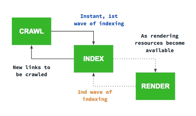
“We do not execute JS due to resource constraints” (in the first wave of indexing)

“Eventually we will do a second wave of indexing, where we execute JS and index your content again”

“…but if you have a large site or lots of frequently changing content, this might not be optimum”

A way around this is pre-rendering or server-side rendering.

https://davidkunnen.com/how-to-get-250k-pages-indexed-by-google/

When creating Devsnap I was pretty naive. I used create-react-app for my frontend and Go with GraphQL for my backend. A classic SPA with client side rendering.

I knew for that kind of site I would have Google to index a lot of pages, but I wasn’t worried, since I knew Google Bot is rendering JavaScript by now and would index it just fine

Oh boy, was I wrong.

At first, everything was fine. Google was indexing the pages bit by bit and I got the first organic traffic.

First indexing

1. Enter SSR

I started by implementing SSR, because I stumbled across some quote from a Googler, stating that client side rendered websites have to get indexed twice. The Google Bot first looks at the initial HTML and immediately follows all the links it can find. The second time, after it has sent everything to the renderer, which returns the final HTML. That is not only very costly for Google, but also slow. That’s why I decided I wanted Google Bot to have all the links in the initial HTML.

Google Bot indexing zycle

I was doing that, by following this fantastic guide. I thought it would take me days to implement SSR, but it actually only took a few hours and the result was very nice.

Indexing with SSR

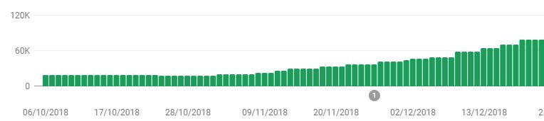
Without SSR I was stuck at around 20k pages indexed, but now it was steadily growing to >100k.

But it was still not fast enough

Google was not indexing more pages, but it was still too slow. If I ever wanted to get those 250k pages indexed and new job postings discovered fast, I needed to do more.

2. Enter dynamic Sitemap

With a site of that size, I figured I’d have to guide Google somehow. I couldn’t just rely on Google to crawl everything bit by bit. That’s why I created a small service in Go that would create a new Sitemap two times a day and upload it to my CDN.

Since sitemaps are limited to 50k pages, I had to split it up and focused on only the pages that had relevant content.

Sitemap index

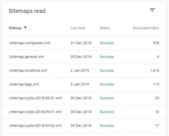
After submitting it, Google instantly started to crawl faster.

But it was still not fast enough

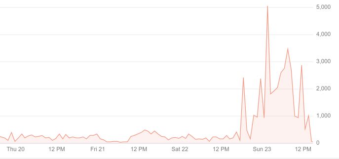
I noticed the Google Bot was hitting my site faster, but it was still only 5-10 times per minute. I don’t really have an indexing comparison to #1 here, since I started implementing #3 just a day later.

3. Enter removing JavaScript

I was thinking why it was still so slow. I mean, there are other websites out there with a lot of pages as well and they somehow managed too.

That’s when I thought about the statement of #1. It is reasonable that Google only allocates a specific amount of resources to each website for indexing and my website was still very costly, because even though Google was seeing all the links in the initial HTML, it still had to send it to the renderer to make sure there wasn’t anything to index left. It simply doesn’t know everything was already in the initial HTML when there is still JavaScript left.

So all I did was removing the JavaScript for Bots.

if(isBot(req)) {

    completeHtml = completeHtml.replace(/<script[^>]*>(?:(?!<\/script>)[^])*<\/script>/g, “”)

Immediately after deploying that change the Google Bot went crazy. It was now crawling 5-10 pages – not per minute – per second.

Google Bot crawling speed

Conclusion

If you want to have Google index a big website, only feed it the final HTML and remove all the JavaScript (except for inline Schema-JS of course).

https://openai.com/blog/chatgpt/

Scripts in the <head>

John Mueller said to move scripts below the <head> whenever possible (source)

SEO JS Checks

Javacript
Screaming Frog – enable Configuration>Spider>Extraction – Store HTML, Store Rendered HTML
Screaming Frog – enable Configuration>Spider>Rendering- enable JS crawling etc.
https://www.reddit.com/r/TechSEO/comments/10l45od/how_to_view_actual_javascript_links_in/
Check page copy, H1s etc is present in HTML of the mobile friendly tool – https://search.google.com/test/mobile-friendly/
Check the drop down filters in the Javascript Tab in Screaming Frog for any issues

Checking JS links in Screaming Frog:

Check javascript content vs “HTML” content

Screaming Frog – Excluding Parameters & URLs in Screaming Frog Crawl [2026]

SCREAMING Frog mother fuckers!

To exclude URLs just go to:

Configuration > Exclude (in the very top menu bar)

To exclude URLs within a specific folder, use the following regex:

^https://www.mydomain.com/customer/account/.*
^https://www.mycomain.com/checkout/cart/.*

The above regex, will stop Screaming Frog from Crawling the customer/account folder and the cart folder.

Or – this is easier for me, as I have to check and crawl lots of international domains with the same site structure and folders:

^https?://[^/]+/customer/account/.*
^https?://[^/]+/checkout/cart/.*

Excluding Images –

Ive just been using the image extensions to block them in the crawl, e.g.

.*jpg

Although you can block them in the Configuration>Spider menu too.

Excluding Parameter URLs

this appears to do the job:

^.*\?.*

My typical “Excludes” looks like this:

^https?://[^/]+/customer/account/.*
^https?://[^/]+/checkout/cart/.*

^.*\?.*
jpg$

png$

.js$

.css$

Update – you can just use this to block any URLs containing “cart” or “account”

/account/|/cart/


Update:

Currently using this for my excludes config, as I actually want to crawl images:

^https?://[^/]+/customer/account/.*
^https?://[^/]+/checkout/cart/.*

^.\?.

.js$

.css$


To exclude any URLs using ? and + (as per our weird URLs with parameters) use – .*[\?\+].*

  • You can just exclude crawling JS and CSS in the crawl > Configuration but I find it slightly quicker this way
  • If you are using JS rendering to crawl, you might want to crawl JS files too. Depending on if they’re required to follow any JS links etc (generally bad idea to have JS links, if you do, have a HTML backup or prerendering in place)

For personal reference –

//div[@class=’product-description’]

//div[@class=’prose’]

/html/body/div[1]/div[3]/main/div[4]/div/div

//div[@class=’category-description read-more’]

SiteNavigationElement Schema – How to Implement [2025]

  • Summary 

To associate name and other elements with the URL, it appears best to use ItemList in the schema markup, below is an example of SiteNavigationElement schema:

Without “position” for ItemList:

script type="application/ld+json">
{"@context":"http://schema.org",
"@type":"ItemList",
"itemListElement":
[
{
@type: "SiteNavigationElement",
name: MMA Equipment",
url:"https://www.blackbeltwhitehat.com/mma"
},
{
"@type": "SiteNavigationElement",
"name": "Cricket Equipment",
"url": "https://www.blackbeltwhitehat.com/cricket"
},
{
@type: "SiteNavigationElement",
name: "Tennis Equipment",
url:"https://www.blackbeltwhitehat.com/tennis"
},
{
@type: "SiteNavigationElement",
name: "Golf Equipment",
url:"https://www.blackbeltwhitehat.com//golf"
},
{
@type: "SiteNavigationElement",
name: "Rugby Equipment",
url:"https://www.blackbeltwhitehat.com/"
},
{
@type: "SiteNavigationElement",
name: "Gym Equipment",
url:"https://www.blackbeltwhitehat.com//gym-equipment"
}
]
}}
</script>
  • Put the SChema in the <head> or <body> tags.
  • Just replace the name and the URL if you want to use the code above.

SiteNavigationSchema – seems like a good idea for most websites to use this schema.

SiteNavigationElement Schema Example 2

Whilst the above schema code validates in all the tests – you’ll ideally want the position “element” in the schema too:

<script type="application/ld+json">
{
 "@context":"https://schema.org",
 "@type":"ItemList",
 "itemListElement":[
 {
 "@type":"ListItem",
 "position":1,
 "url":"https://example.com/dave/mma-guy"
 },
 {
 "@type":"ListItem",
 "position":2,
 "url":"https://example.com/dave/cheeky-exec"
 },
 {
 "@type":"ListItem",
 "position":3,
 "url":"https://example.com/dave/ppc-seo"
 }
 ]
}
</script>

It is in schema format so directly informs Google of page locations and what they’re about.

You can put it separately from the main navigation markup, in either the <head> or the <body> when using the recommended JSON format. Which effectively gives Googlebot an additional number of links to crawl or at least acknowledged with some additional data describing what the links are about.

There are some old posts saying Navigation Schema is not approved by Google, but it now appears to be on the list of approved schema – screenshotted below “SiteNavigationElement”:

https://schema.org/docs/full.html

SiteNavigationElement Schema Generator

Chat GPT can do it, but you have to give it the example above or it lays it all out weird.

This is the prompt that I used:

and the result:

<script type="application/ld+json">
{
"@context":"https://schema.org",
"@type":"ItemList",
"itemListElement":[
{
"@type":"ListItem",
"position":1,
"url":"https://www.bikes.co.uk/"
},
{
"@type":"ListItem",
"position":2,
"url":"https://www.bikes.co.uk/electric-mountain-bikes"
},
{
"@type":"ListItem",
"position":3,
"url":"https://www.bikes.co.uk/infusion-grey-electric-bike"
},
{
"@type":"ListItem",
"position":4,
"url":"https://www.bikes.co.uk/hybrid-electric-bikes"
},
{
"@type":"ListItem",
"position":5,
"url":"https://www.bikes.co.uk/electric-bikes-under-1000"
},
{
"@type":"ListItem",
"position":6,
"url":"https://www.bikes.co.uk/swift-electric-heritage-step-through-ebike-dark-grey"
},
{
"@type":"ListItem",
"position":7,
"url":"https://www.bikes.co.uk/electric-bike-batteries"
},
{
"@type":"ListItem",
"position":8,
"url":"https://www.bikes.co.uk/careers"
},
{
"@type":"ListItem",
"position":9,
"url":"https://www.bikes.co.uk/electric-bikes-under-400"
},
{
"@type":"ListItem",
"position":10,
"url":"https://www.bikes.co.uk/ebikes-patriot-grey-orange"
},
{
"@type":"ListItem",
"position":11,
"url":"https://www.bikes.co.uk/privacy-policy-cookie-restriction-mode"
},
{
"@type":"ListItem",
"position":12,
"url":"https://www.bikes.co.uk/hardtail-electric-mountain-bikes"
},
{
"@type":"ListItem",
"position":13,
"url":"https://www.bikes.co.uk/returns-policy"
},
{
"@type":"ListItem",
"position":14,
"url":"https://www.bikes.co.uk/contact"
},
{
"@type":"ListItem",
"position":15,
"url":"https://www.bikes.co.uk/warranty"
},
{
"@type":"ListItem",
"position":16,
"url":"https://www.bikes.co.uk/folding-electric-bikes"
},
{
"@type":"ListItem",
"position":17,
"url":"https://www.bikes.co.uk/electric-bike-accessories"
},
{
"@type":"ListItem",
"position":18,
"url":"https://www.bikes.co.uk/step-through-electric-bikes"
},
{
"@type":"ListItem",
"position":19,
"url":"https://www.bikes.co.uk/swifty-liberte-folding-electric-bike-pink"
},
{
"@type":"ListItem",
"position":20,
"url":"https://www.bikes.co.uk/electric-hybrid-bikes"
},
{
"@type":"ListItem",
"position":21,
"url":"https://www.bikes.co.uk/klarna-finance-info"
},
{
"@type":"ListItem",
"position":22,
"url":"https://www.bikes.co.uk/faqs"
},
{
"@type":"ListItem",
"position":23,
"url":"https://www.bikes.co.uk/customer-reviews"
},
{
"@type":"ListItem",
"position":24,
"url":"https://www.bikes.co.uk/womens-electric-bikes"
},
{
"@type":"ListItem",
"position":25,
"url":"https://www.bikes.co.uk/delivery"
}
]
}
</script>

From what I’ve read and from the example I’ve been sent during my ‘research’, it appears you can have the schema code, completely separate to the main HTML navigation code – so effectively adds an additional incidence of HTML links (which is good).

Implementing Navigation Schema

If using JSON – put the schema code in <head> or <body> of HTML page

The schema can be placed on all of the site’s pages.

CSS Flexbox for Beginners [2022]

Flexbox helps you to align elements. It’s much easier and better than Float etc

Flexbox is generally used for small-scale layouts, whereas Grid is used for larger stuff.

Flexbox has 2 axes. The main axes and the cross axes.

The main axis is defined by the flex-direction property.

The cross axis will automatically run perpendicular to the main axis.

Image Source

Flexbox Main Axis

The main axis is defined by flex-direction.

Flex-direction has 4 possible values:

  • Row
  • Row-reverse
  • Column
  • Column-reverse

In the screenshot below,

display:flex makes container-1 a flex item

flex:1 – for each of the boxes, makes them evenly distributed in terms of their width. As all the flex items are given a value of 1, they are all the same size.

If you were to change the flex value for .box-1 to 4, then box-1 would take up four-sixths (4/6) of the page:

Change the order of Flex Items

With flexbox you can change the order of the flex-items, (the boxes) without changing the HTML.

To do this use the “order” property.

The code below will put box-1 in the second position, left to right.

Flex-direction: Column

By giving the container the flex-direction property, with a value of “column”, the boxes / flex items will stack on top of each other

Justify-Content

You can use the “justify-content” property to align the boxes within the flex container.

justify-content: flex-end; will push all the flex items to the right

Justify-content:center; will place the boxes in the centre of the container

Justify-content:space-between;

Aligns the content spaced evenly across the entire width of the container, with margins in between:

Space-around will add some “space around” the items, so that they have margins in between the items and also to the sides of the left-most and right-most items:

Flex Grow

If after the dimensions of the flex-items have been set, they leave room or space, you can use the “flex-grow” property.

If you give each flex item a flex grow value of 1, then the items will take up an equal amount of the remaining space.

It could be 1, or 100, it won’t make a difference if all the items have the same value.

Below, flex item “one”, is the only flex item with a “flex grow” property, and it therefore takes up all the space that was left over from left to right by the 3 boxes.

Finding & Fixing CSS Spacing Issues with Dev Tools

One of the things I’ve found a bit of a ball ache as a developing developer, is sorting out spacing i.e. padding and margin issues when creating pages using Magento.

For example, let’s say I want to change the spacing above an image.

Best thing I’ve found to do to find the margin or padding that I want to change:

  • Right click on image – choose Inspect Element
  • In the “styles” tab of dev tools, look for margin and padding styles

In this instance, it’s not the image, or the images div or container that’s causing the spacing that I don’t want:

In this instance, I click on the “Div” or container, that the image resides within (the parent element)

Now I’ve found the issue with the spacing at the top that is too large:

  • I can now go into the stylesheet and amend the class “content-image section” or just add an in-line style to this individual incidence of the class, and change “margin-top” to something like 15px.

When you are inspecting an element in Chrome, Dev tools will also tend to highlight (in a dark shade) the spacing around that element too, so it shows you which element is generating the padding or margin.

Smart Slider for WordPress – Simple Guide [2022]

Adding image slider in WordPress

In the admin panel, on the left side there is now an option called “smart slider”.

 When going into there you can select – “dashboard” from the side-menu that appears and then select to create a “new project”.

When creating a new project you can give that slider a specific name etc if you want to

The project type you’d likely want to use is slider and slider type simple, you’d probably want the name to be a reference to the post it is for.

When you add a slide, you can select image which will give you a prompt to add an image from the media library.

Once it’s been set up you need to add the shortcode in the blog editor section and it should populate itself on the frontend, this slider in the example was given an ID of 2, so you’d add [smartslider3 slider=”2”]

CSS Transitions for Beginners [2022]

Image source

What are Transitions in CSS?

Transitions are used to change the properties or the style of an element.

The transition is kind of like the “animation” that occurs between the two states of the element. Although CSS animations are a different thing. Which is confusing. Sorry.

Transitions and animations are great for grabbing people’s attention (for example in a banner ad) or for enhancing User Experience (UX). In other words, transitions look nice.

Transitions are the bit that happens when an element, like a box for example, changes size to a new state.

Original State —Transition—> New State

Box with 200px width —user clicks to cause transition—> Box with 400px

Gif Source

You might use transitions for example, to dictate how an element changes when it is “hovered” over with a mouse pointer.

With the code above, the element given the class of “box”, will change from 200px width to 400px when someone hovers over it with their mouse.

The code above will have no transition, it will just change from one to the other.

With transition-property and transition duration added, the box will move gradually from 200px to 400px, over the course of 1 second.

Transition-duration can be set in ms (milliseconds) or seconds in CSS, but Javascript, only uses ms.

Transition Properties

To create a CSS transition, you need to specify the transition-property and the transition duration.

The transition-property dictates, what is going to change, for example, the width and height:

transition-property: width, height;

The transition duration dictates the length of time a transition should take, e.g.

 transition-duration: 2s;

Transition-delay, specifies how long a transition should take to being, and transition-timing-function dictates how fast and slow the transition should occur (more info below).

CSS Transition Examples

In the example below, the box is given a class of “box” inside the HTML.

In the CSS sheet, this class is selected with the dot/period/fullstop – “.box” and given styles that include 300px height and width.

Here the box is also given the transition-duration of 350ms and the transition-property style states that the background is what will change.

The .box:hover dictates how the style will change when the box is hovered over with a mouse pointer. In the example, it will rotate 45 degrees and change colour.

The transition-property property specifies the name of the CSS property the transition effect is for (the transition effect will start when the specified CSS property changes).

Tip: A transition effect could typically occur when a user hover over an element.

Note: Always specify the transition-duration property, otherwise the duration is 0, and the transition will have no effect.

https://www.w3schools.com/cssref/css3_pr_transition-property.php

Here’s a real-life example of a transition:

You can just write “all”, but best-practice is to state all of the properties you want to change with your transition:

css transition property

Transition-Timing-Function

By default, your transitions will “ease” into the new styles.

ease

Ease is the default value. Ease increases in velocity towards the middle of the transition, slowing back down at the end.

linear

Transitions at an even speed.

ease-in

Starts off slowly, with the transition speed increasing until complete.

ease-out

Starts transitioning quickly, slowing down the transition continues.

ease-in-out

Starts transitioning slowly, speeds up, and then slows down again.cubic-bezier(p1, p2, p3, p4)

Cubic-Bezier

If you really want to, you can also define your own transition speeds using cubic-bezier. The easiest way to do this is to use a generator.

Image Source

Testing Transitions with Chrome Dev Tools

You can “visualise” transitions, using Inspect Element/Chrome Developer Tools and clicking on “ease” or the transition-property you’ve created/stated:

You can also play around with rotation

Remember to copy the code before you exit Chrome dev tools.

Warning about CSS Transitions

If you can limit transitions to transforms and opacity.

A browser can use a graphics card for transforms and opacity.

For other transitions, you can create transitions which will look strange and very jerky for some users. This is especially true if you set the transition-property to “all”, rather than specific elements.

Be careful when using transitions on box shadows, borders, backgrounds etc.

CSS Positions Explained [2022]

Static

Static is the default position for all the HTML elements.

Static, effectively doesn’t do much, it just means the element like an image or text will follow the normal flow of the page/DOM.

Static elements are a bit shit and kinda lazy, static positioned elements cannot have the z-indextopleftright, or bottom properties applied to them.

If Static was a TV character, it would be Onslow from Keeping Up Appearances

Static example

Relative Position

Relative positions are pretty similar to static positions, but you can add z-index, top, left, right, and bottom properties to it.

Relative positions go with the normal flow, but can be taken out of the flow (kind of) by adding properties for its position.

Think of relative position like a dog surfer. For no reason at all.

Only joking, because it goes with the flow, but if you shout at it really loudly, you can make it move in specific directions. Maybe.

Absolute Position

Absolute position, removes the element from the normal document flow.

It goes where it wants, regardless of other elements.

The other elements are not moved or effected by an absolute element.

Absolute positioned elements have their width defaulted to auto instead of being full width like a div

absolute css

https://blog.webdevsimplified.com/2022-01/css-position/

In the above image, the “one” class/element is given 0 for the top and left properties, so it remains in the default position, on the top left of the screen.

Fixed Position

A fixed position in css, is based on the users viewport. A fixed postion element stays in the same place on the users screen, even when the user scrolls.

below is how w3 schools describe fixed positioning:

Sticky Positioning

Sticky elements, stick to the users viewport.

Here’s an example, the heading “do you know all about sticky element”:

source

source

Block

Block doesn’t appear to be a type of positioning in CSS, but I still see it a lot when looking at code and is kind of related to positioning, so thought I’d better cover it.

Most things are blocks. A paragraph for example is a block.

Block elements always stack on top of one another, even if they have room to go side by side, they don’t.

By default, bock elements have a default of 100% – meaning that they take up the whole width of the page.

The only thing that limits there width, is usually the parent element’s padding or margins.

Inline-elements, are a bit different, in that unlike paragraphs etc. they don’t create a new line. For example, a link uses an inline-block element:

You can’t add padding or margins to inline-elements.

Inline-Block

However! You can give margin and padding to an inline-block.

This can be a good block to use, if you don’t want an element, for example a button, to take up the entire width of the page.

For example, if you want to place three buttons in a row, you can use inline-block.

Grid Positioning Example

One final, pratical example of positioning :

CSS Grid with Image and Text Side by Side Example

Here’s another example from css-tricks.com

Grid and flexbox are classed as layouts, rather than positions, which is kind of rubbish (according to my Dunning Kruger opinion) in that you use them to position elements.

CSS – Measurement Units [2022]

css measurement units

https://www.udemy.com/course/css-bootcamp-master-in-css-including-css-grid-flexbox/learn/lecture/10772490#overview

Some HTML elements have default sizes. For example, default for paragraph (<p>) text, is 16px.

You can change the size of text with the “font-size:” property in CSS

Relative Sizes in CSS

Relative sizes and measurements are a bit confusing to us newbies.

The em is simply the font size. In an element with a 2in font, 1em thus means 2in. Expressing sizes, such as margins and paddings, in em means they are related to the font size, and if the user has a big font (e.g., on a big screen) or a small font (e.g., on a handheld device), the sizes will be in proportion. Declarations such as text-indent: 1.5em and margin: 1em are extremely common in CSS.

https://www.w3.org/Style/Examples/007/units.en.html#:~:text=The%20em%20is%20simply%20the,sizes%20will%20be%20in%20proportion.

Using an em value creates a dynamic or computed font size (historically the em unit was derived from the width of a capital “M” in a given typeface.). The numeric value acts as a multiplier of the font-size property of the element on which it is used. Consider this example:

p {
  font-size: 2em;
}

In this case, the font size of <p> elements will be double the computed font-size inherited by <p> elements. By extension, a font-size of 1em equals the computed font-size of the element on which it is used.

https://developer.mozilla.org/en-US/docs/Web/CSS/font-size

If a font-size has not been set on any of the <p>‘s ancestors, then 1em will equal the default browser font-size, which is usually 16px.

So, by default 1em is equivalent to 16px, and 2em is equivalent to 32px.

If you were to set a font-size of 20px on the <body> element say, then 1em on the <p> elements would instead be equivalent to 20px, and 2em would be equivalent to 40px.

In order to calculate the em equivalent for any pixel value required, you can use this formula:

em = desired element pixel value / parent element font-size in pixels

For example, suppose the font-size of the <body> of the page is set to 16px. If the font-size you want is 12px, then you should specify 0.75em (because 12/16 = 0.75). Similarly, if you want a font size of 10px, then specify 0.625em (10/16 = 0.625); for 22px, specify 1.375em (22/16).

The em is a very useful unit in CSS since it automatically adapts its length relative to the font that the reader chooses to use.

https://developer.mozilla.org/en-US/docs/Web/CSS/font-size

Percentage

When the font-size is specified as a percentage, it is relative to the parent element’s font size

Percent (%): The percent unit is much like the “em” unit, save for a few fundamental differences. First and foremost, the current font-size is equal to 100% (i.e. 12pt = 100%). While using the percent unit, your text remains fully scalable for mobile devices and for accessibility.

https://kyleschaeffer.com/css-font-size-em-vs-px-vs-pt-vs-percent

You can use percentage values. They act like em values.

The value is relative to the parent‘s font-size.
As a result, the value will cascade if used on child elements.

Rem

The value is relative to the root element‘s font-size, which is the <html> element.
As a result, the value will not vary depending on the depth of the element in the HTML hierarchy, and will reamin context independent.

https://cssreference.io/property/font-size/

VH – Viewport Height

The viewport is the browser window size.

1vh will mean that the element or font will take up 1% of the viewport/browser window.

height:100vh, will mean the element, font etc will be 100% and take up the height of the entire browser window

Viewport width, is “vw”

You can set width, for example the width of a background to a percentage of the width of the user’s browser window. For example
width:50vw; will take up 50% of the width of the screen.

If you want to learn more, video below is decent:

CSS Pseudo Classes & Pseudo Elements for beginners [2025]

Pseudo classes – define a special state of an element – for example a:hover (when a mouse pointer is over an element)

Pseudo elements – define the style for a specific part of an element. Pseudo elements use two colons , for example h1::after

Pseudo class examples

a:link pseudo class, defines the normal state of a link – i.e. before someone interacts with it.

a:visited pseudo class, defines the state of the link text when it has been clicked.

a:hover pseudo class defines what happens to the link text when the mouse hovers over it

a:active psuedo class, defines the text link colour when it is clicked

Drop Down Menu Using Pseudo Classes

One really cool thing you can do with pseudo classes, is to create a drop down menu.

W3 school lets anyone, yes anyone! use drop down classes, to create, well, drop down menus. The legends.

In the codepen example above, I just put all this in my HTML, no CSS required. Madness.

<html>
<title>W3.CSS</title>
<meta name="viewport" content="width=device-width, initial-scale=1">
<link rel="stylesheet" href="https://www.w3schools.com/w3css/4/w3.css">
<body>

<div class="w3-container">
  <h2>Dropdown Button</h2>
  <p>Move the mouse over the button to open the dropdown content.</p>
  <div class="w3-dropdown-hover">
    <button class="w3-button w3-black">Hover Over Me!</button>
    <div class="w3-dropdown-content w3-bar-block w3-border">
      <a href="#" class="w3-bar-item w3-button">Link 1</a>
      <a href="#" class="w3-bar-item w3-button">Link 2</a>
      <a href="#" class="w3-bar-item w3-button">Link 3</a>
    </div>
  </div>
</div>

</body>
</html>

Lists Styles

Apparently, list items are selected using “pseudo-selectors”.

By default lists include bullet points.

Use the – list-style-type property to change the style/numbers etc for each list item.

list-style-type: none – will remove any of the styles from the list – no bullet points or numbers etc.

If you want to style individual list items;

For example – ul li: first child { color:red; } will make the text of the first list item, red.

ul li: nth-child (3) { color:blue; } is another method (it’s actually a “CSS method” in technical terms), that in this case, will color the 3rd list item text blue.

Pseudo Elements

define the style for a specific part of an element. Pseudo elements use two colons , for example h1::after

Pseudo elements can be used to, for example, to style the first letter or line of a specific element

Insert content before a specific element

W3schools have some good info on pseudo elements here.

Some examples in the codepen below:

Before content

h1::before {

content: “this is a before thingy”;

color : green

before psuedo element, will put text before a specific element, there’s also “after”, which as you’ve probably guessed, places the content after the element.