CSS Flexbox for Beginners [2022]

Flexbox helps you to align elements. It’s much easier and better than Float etc

Flexbox is generally used for small-scale layouts, whereas Grid is used for larger stuff.

Flexbox has 2 axes. The main axes and the cross axes.

The main axis is defined by the flex-direction property.

The cross axis will automatically run perpendicular to the main axis.
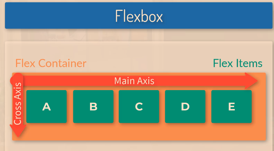
Image Source

Flexbox Main Axis

The main axis is defined by flex-direction.

Flex-direction has 4 possible values:

  • Row
  • Row-reverse
  • Column
  • Column-reverse

In the screenshot below,

display:flex makes container-1 a flex item

flex:1 – for each of the boxes, makes them evenly distributed in terms of their width. As all the flex items are given a value of 1, they are all the same size.

If you were to change the flex value for .box-1 to 4, then box-1 would take up four-sixths (4/6) of the page:

Change the order of Flex Items

With flexbox you can change the order of the flex-items, (the boxes) without changing the HTML.

To do this use the “order” property.

The code below will put box-1 in the second position, left to right.

Flex-direction: Column

By giving the container the flex-direction property, with a value of “column”, the boxes / flex items will stack on top of each other

Justify-Content

You can use the “justify-content” property to align the boxes within the flex container.

justify-content: flex-end; will push all the flex items to the right

Justify-content:center; will place the boxes in the centre of the container

Justify-content:space-between;

Aligns the content spaced evenly across the entire width of the container, with margins in between:

Space-around will add some “space around” the items, so that they have margins in between the items and also to the sides of the left-most and right-most items:

Flex Grow

If after the dimensions of the flex-items have been set, they leave room or space, you can use the “flex-grow” property.

If you give each flex item a flex grow value of 1, then the items will take up an equal amount of the remaining space.

It could be 1, or 100, it won’t make a difference if all the items have the same value.

Below, flex item “one”, is the only flex item with a “flex grow” property, and it therefore takes up all the space that was left over from left to right by the 3 boxes.

Finding & Fixing CSS Spacing Issues with Dev Tools

One of the things I’ve found a bit of a ball ache as a developing developer, is sorting out spacing i.e. padding and margin issues when creating pages using Magento.

For example, let’s say I want to change the spacing above an image.

Best thing I’ve found to do to find the margin or padding that I want to change:

  • Right click on image – choose Inspect Element
  • In the “styles” tab of dev tools, look for margin and padding styles

In this instance, it’s not the image, or the images div or container that’s causing the spacing that I don’t want:

In this instance, I click on the “Div” or container, that the image resides within (the parent element)

Now I’ve found the issue with the spacing at the top that is too large:

  • I can now go into the stylesheet and amend the class “content-image section” or just add an in-line style to this individual incidence of the class, and change “margin-top” to something like 15px.

When you are inspecting an element in Chrome, Dev tools will also tend to highlight (in a dark shade) the spacing around that element too, so it shows you which element is generating the padding or margin.

Smart Slider for WordPress – Simple Guide [2022]

Adding image slider in WordPress

In the admin panel, on the left side there is now an option called “smart slider”.

 When going into there you can select – “dashboard” from the side-menu that appears and then select to create a “new project”.

When creating a new project you can give that slider a specific name etc if you want to

The project type you’d likely want to use is slider and slider type simple, you’d probably want the name to be a reference to the post it is for.

When you add a slide, you can select image which will give you a prompt to add an image from the media library.

Once it’s been set up you need to add the shortcode in the blog editor section and it should populate itself on the frontend, this slider in the example was given an ID of 2, so you’d add [smartslider3 slider=”2”]

CSS Transitions for Beginners [2022]

Image source

What are Transitions in CSS?

Transitions are used to change the properties or the style of an element.

The transition is kind of like the “animation” that occurs between the two states of the element. Although CSS animations are a different thing. Which is confusing. Sorry.

Transitions and animations are great for grabbing people’s attention (for example in a banner ad) or for enhancing User Experience (UX). In other words, transitions look nice.

Transitions are the bit that happens when an element, like a box for example, changes size to a new state.

Original State —Transition—> New State

Box with 200px width —user clicks to cause transition—> Box with 400px

Gif Source

You might use transitions for example, to dictate how an element changes when it is “hovered” over with a mouse pointer.

With the code above, the element given the class of “box”, will change from 200px width to 400px when someone hovers over it with their mouse.

The code above will have no transition, it will just change from one to the other.

With transition-property and transition duration added, the box will move gradually from 200px to 400px, over the course of 1 second.

Transition-duration can be set in ms (milliseconds) or seconds in CSS, but Javascript, only uses ms.

Transition Properties

To create a CSS transition, you need to specify the transition-property and the transition duration.

The transition-property dictates, what is going to change, for example, the width and height:

transition-property: width, height;

The transition duration dictates the length of time a transition should take, e.g.

 transition-duration: 2s;

Transition-delay, specifies how long a transition should take to being, and transition-timing-function dictates how fast and slow the transition should occur (more info below).

CSS Transition Examples

In the example below, the box is given a class of “box” inside the HTML.

In the CSS sheet, this class is selected with the dot/period/fullstop – “.box” and given styles that include 300px height and width.

Here the box is also given the transition-duration of 350ms and the transition-property style states that the background is what will change.

The .box:hover dictates how the style will change when the box is hovered over with a mouse pointer. In the example, it will rotate 45 degrees and change colour.

The transition-property property specifies the name of the CSS property the transition effect is for (the transition effect will start when the specified CSS property changes).

Tip: A transition effect could typically occur when a user hover over an element.

Note: Always specify the transition-duration property, otherwise the duration is 0, and the transition will have no effect.

https://www.w3schools.com/cssref/css3_pr_transition-property.php

Here’s a real-life example of a transition:

You can just write “all”, but best-practice is to state all of the properties you want to change with your transition:

css transition property

Transition-Timing-Function

By default, your transitions will “ease” into the new styles.

ease

Ease is the default value. Ease increases in velocity towards the middle of the transition, slowing back down at the end.

linear

Transitions at an even speed.

ease-in

Starts off slowly, with the transition speed increasing until complete.

ease-out

Starts transitioning quickly, slowing down the transition continues.

ease-in-out

Starts transitioning slowly, speeds up, and then slows down again.cubic-bezier(p1, p2, p3, p4)

Cubic-Bezier

If you really want to, you can also define your own transition speeds using cubic-bezier. The easiest way to do this is to use a generator.

Image Source

Testing Transitions with Chrome Dev Tools

You can “visualise” transitions, using Inspect Element/Chrome Developer Tools and clicking on “ease” or the transition-property you’ve created/stated:

You can also play around with rotation

Remember to copy the code before you exit Chrome dev tools.

Warning about CSS Transitions

If you can limit transitions to transforms and opacity.

A browser can use a graphics card for transforms and opacity.

For other transitions, you can create transitions which will look strange and very jerky for some users. This is especially true if you set the transition-property to “all”, rather than specific elements.

Be careful when using transitions on box shadows, borders, backgrounds etc.