

Static
Static is the default position for all the HTML elements.
Static, effectively doesn’t do much, it just means the element like an image or text will follow the normal flow of the page/DOM.
Static elements are a bit shit and kinda lazy, static positioned elements cannot have the z-index, top, left, right, or bottom properties applied to them.
If Static was a TV character, it would be Onslow from Keeping Up Appearances
Static example
Relative Position
Relative positions are pretty similar to static positions, but you can add z-index, top, left, right, and bottom properties to it.
Relative positions go with the normal flow, but can be taken out of the flow (kind of) by adding properties for its position.
Think of relative position like a dog surfer. For no reason at all.
Only joking, because it goes with the flow, but if you shout at it really loudly, you can make it move in specific directions. Maybe.

Absolute Position
Absolute position, removes the element from the normal document flow.
It goes where it wants, regardless of other elements.
The other elements are not moved or effected by an absolute element.
Absolute positioned elements have their width defaulted to auto instead of being full width like a div

https://blog.webdevsimplified.com/2022-01/css-position/
In the above image, the “one” class/element is given 0 for the top and left properties, so it remains in the default position, on the top left of the screen.
Fixed Position
A fixed position in css, is based on the users viewport. A fixed postion element stays in the same place on the users screen, even when the user scrolls.
below is how w3 schools describe fixed positioning:


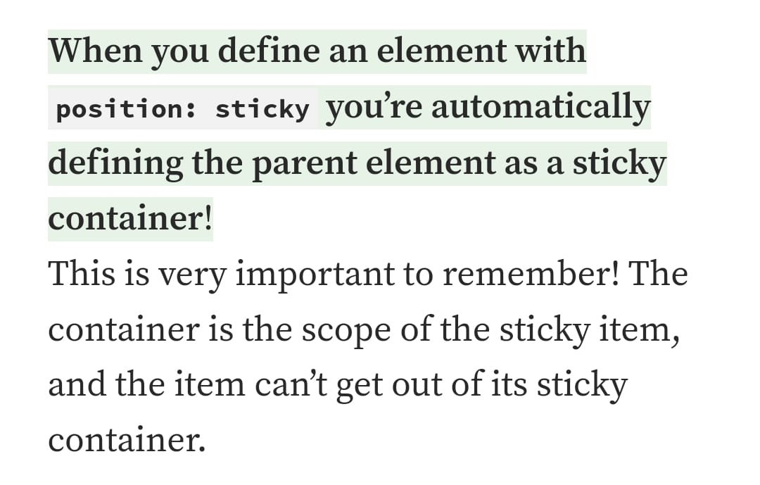
Sticky Positioning
Sticky elements, stick to the users viewport.
Here’s an example, the heading “do you know all about sticky element”:


Block
Block doesn’t appear to be a type of positioning in CSS, but I still see it a lot when looking at code and is kind of related to positioning, so thought I’d better cover it.
Most things are blocks. A paragraph for example is a block.

Block elements always stack on top of one another, even if they have room to go side by side, they don’t.
By default, bock elements have a default of 100% – meaning that they take up the whole width of the page.
The only thing that limits there width, is usually the parent element’s padding or margins.
Inline-elements, are a bit different, in that unlike paragraphs etc. they don’t create a new line. For example, a link uses an inline-block element:
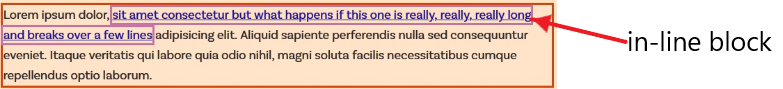
You can’t add padding or margins to inline-elements.
Inline-Block
However! You can give margin and padding to an inline-block.
This can be a good block to use, if you don’t want an element, for example a button, to take up the entire width of the page.
For example, if you want to place three buttons in a row, you can use inline-block.

Grid Positioning Example
One final, pratical example of positioning :
CSS Grid with Image and Text Side by Side Example
Here’s another example from css-tricks.com
Grid and flexbox are classed as layouts, rather than positions, which is kind of rubbish (according to my Dunning Kruger opinion) in that you use them to position elements.
 Small Business Dad