
Insightful Data in Excel
Try and have tables without any blanks in the data.
Have a different column for each type of data. E.g. a column for age, name, score etc.
With different rows representing different entries or records/people/IDs
Have a primary ID, something that is distinct from other entries. For example an ID number or a name.
Sorting Highest to Lower in a Table Column
Click inside the column
Go to the Data tab, click the ZA–> icon
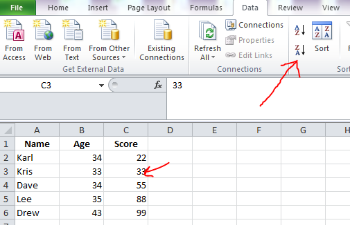
You can also just right click with your mouse on the table, and there will be a “sort” option on the pop up menu
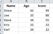
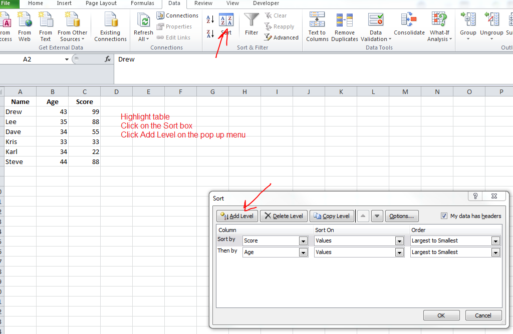
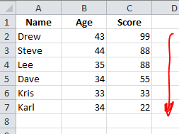
Sort Table Data by 2 Criteria
Sort by score, and then age.
This will sort the data, with the highest Score at the top.
If any scores are the same, the oldest person will appear highest.
You can use the two arrows on the pop-up menu (to the left of Options…) to change what is the primary and secondary sorting factor.
Sorting by Colour
Click on the sort button on the Data tab (the one that looks like a box with AZ—> on it twice)
This should bring up the menu/sort-dialogue-box
Choose a primary-sorting-factor, e.g. Score
and then in the middle drop-down menu, beneath “sort on”, choose “Cell Color”
Add a level if you want to sort by another colour
Filter
CTRL SHIFT L
Or on the data tab, click the filter icon
Each column in your data, should now have a drop down menu displayed form the column-header
You can then copy (CTRL C) and paste (CTRL V) the filtered data, onto another sheet
Number Filters
If you have a column, like Score or Age that is numeric data – click on the header of one of the columns to open the drop-down menu that the filter has produced.
On the menu, choose/hover over “Number Filters” to open the side menu
There are a whole host of number filters. You can for example, show the top 10 entries/rows, for Score, or just shows scores, greater than 50.
Date Filters
Excel recognise dates. The same drop down menu will present you with a “Date Filters” option (rather than number filters). You can choose to show next week’s dates only, yesterday etc. There are also Text Filters, for general text; you can show, for example, all those rows that begin with a certain letter or phrase
Pivot Tables
“A feature that can easily make calculations with 1 or more criteria”
To insert a pivot table, you need to click on a single cell inside your original table of data
Then go to the Insert tab at the top (next to the home tab)
– click the Pivot Table button on the top left
(Or ALT N, V, T as a keyboard shortcut)
Click OK on the pop up box to place a pivot table on a new sheet
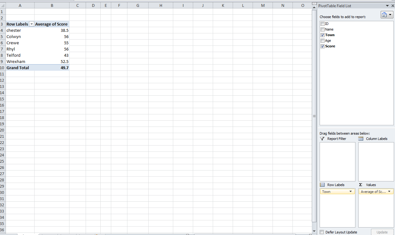
On the right hand side, you should see all your ‘field’ names and 4 boxes.
To analyse the data you need to drag the field names, down to the correct locations.
You need to visualise what table you want in order to do this.
Remember, rows labels represent different entries of data (you might want name, for example to be a row label), column labels represent the headings of the different data for each entry e.g. Age and Score – but you might want to put the column headings from your original table, into rows on the pivot table; depending on what data you want to see/filter.
You can right click on an individual cells, and summarise values as averages etc.
It’s probably easier to watch this video to learn Pivot tables to be fair (from 25:57):
To use pivot tables effectively –
1. Find out what data you need/want
2. Design the table layout which would show you that data
3. Create the pivot table
This is a lot faster and easier than using formulas to get the information
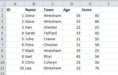
Below for example, I have used a pivot table to see what the average score is per town, from this table:
Using this pivot table:
To change the actual look of the pivot table, go to the Design tab on the top right.
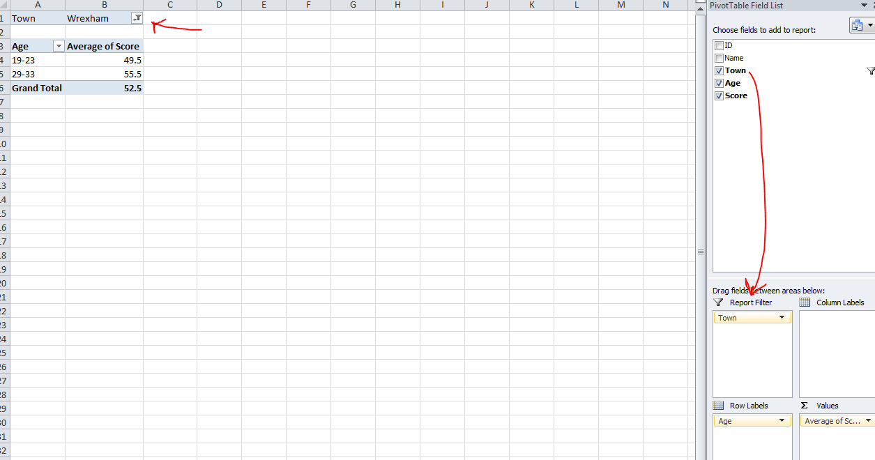
Right click on one of the row headings on your pivot table – you can “Group…” different numbers etc. to organise the rows. e.g. you could group ages in increments of 5, to spot any trends across those age groups

The report filter lets you filter in and out different data.
For example, you could filter by town; and switch from a table showing different towns and their scores by age.
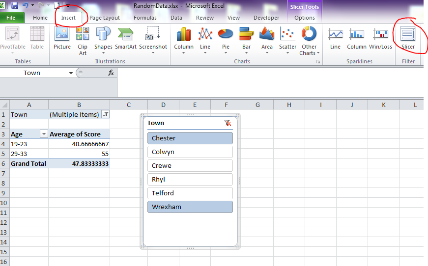
Alternatively, under the Options tab, you can Insert Slicer. This will produce clickable buttons that will change the data sets to whatever’s on the filters. You can hold down the ctrl key and click multiple items on each slicer.
Graph
Click on a cell in your table, press F11 or ALT, F1 to insert a chart (or go to the Insert tab and choose a column chart)

SUMIF
Instead of using pivot tables, you can use formulas to analyse data.
The following screen-shot, uses SUMIF.
Type =SUMIF( in a cell close to the table,
select the table or all the columns that include the criteria to find, and the criteria to sum (Town and Score in this case)
Type a comma, then click on a cell that contains your lookup/sum criteria (e.g. “Wrexham”)
Then type a final comma, and select what you want adding – in this case, the scores. Then close the brackets and hit Enter
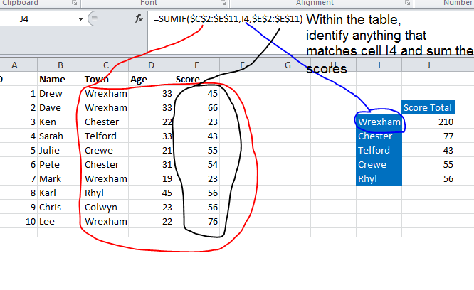
Note – selecting the top cell, and holding CTRL + SHIFT + DOWN ARROW, will select a whole column
– By clicking between the C2, E11, E2 and E11 with my mouse and then pressing F4, I have “locked down” the range to look up the scores and town names. Therefore, when I ‘drag down’ the formula in the table to the right, the cell I4 with “Wrexham” within it will change down to “Chester” (cell I5) when I drag down the formula to the next row. However, the lookup values for the table range and the sum range, will not change
