TL;DR
- Adverts look “AI” when the AI makes every decision. Let it make the picture; you make the choices.
- Brief first: who it’s for, the one message, where it’ll be seen, how it should feel.
- Prompt like a photographer: real setting, light, lens, film stock and empty space. Drop “stunning 8k masterpiece”.
- Fix the tells: hands, gibberish text, waxy skin, glow, melting edges, dead-centre framing.
- Never let AI write your words. Set the type yourself, two typefaces maximum.
- Keep the real product in shot, crop off-centre, tone the colour down, add grain, then squint-test it at phone size.
- Event posters: the date and details are the design, make 4:5 and 9:16 versions, use one real idea instead of a silhouette crowd, and build a reusable template.
- Short on time? Jump to the hack near the end for copy-and-paste prompts.
AI can produce a poster in seconds, but most people can spot one just as fast. The glossy skin, the orange-and-teal glow, the gibberish lettering and the perfectly centred everything give it away before anyone reads a word.
The fix isn’t a magic prompt. It’s treating the AI as one tool in a normal design process: you brief it, you direct it, then you finish the work by hand. Follow the seven steps below and your posters and adverts will read as designed, not generated. There’s a finished example poster at the end.
Step 1: Start with a brief, not a prompt
The biggest giveaway of an AI advert is that it isn’t about anything. Someone typed “cool poster for a bakery” and accepted the first result, so the image is a generic average of every bakery picture ever made.
Before you open any image tool, answer four questions in plain words: who it’s for, the single message, where it will be seen, and how it should feel. Collect two or three real photos or adverts you admire as references.
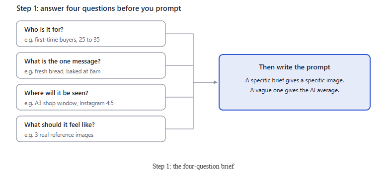
The format question matters more than people think. A shop-window A3 poster, a 4:5 Instagram post and a 16:9 web banner need different compositions, so decide the shape first and generate at that ratio.
Step 2: Prompt like a photographer, not a fan
Words like “stunning”, “8k”, “hyper-realistic” and “masterpiece” are the fastest route to the AI look. They push the model towards over-sharpened, over-lit, over-saturated images.
Describe the shot the way a photographer or art director would brief a crew: the subject in a real setting, the light, the lens, the film stock and where the empty space should go.
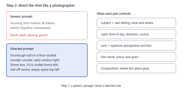
Ask for empty space on purpose. Real adverts leave room for a headline and a logo, and AI images tend to fill every corner. Generate several variations and pick the one that looks least “perfect”, not the most impressive.
Step 3: Hunt down the AI tells
Viewers don’t consciously analyse an image; they notice that something feels off. Almost always it’s one of six details, so check each one before you go any further.
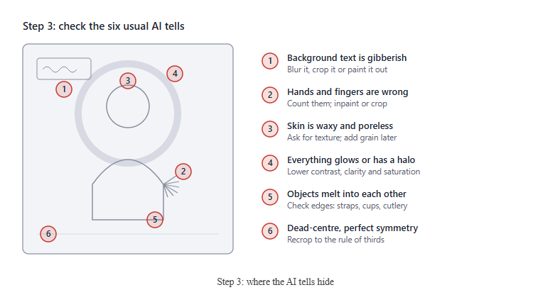
Most modern tools let you select a small area and regenerate just that part (often called inpainting or generative fill). Use it for hands, edges and background signs. If a detail still won’t come right, crop it out; a tighter crop usually looks more intentional anyway.
Step 4: Never let the AI do your typography
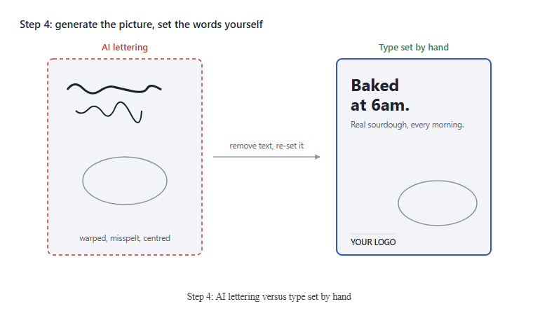
Even the best image models still wobble on letters, and they love a big centred headline. That one habit gives away more AI adverts than anything else.
Generate the image with no text at all (add “no text, no lettering, no logos” to your prompt), then set the words yourself in Canva, Figma, Affinity, Photoshop or whatever you use.
Use no more than two typefaces, align text to an edge rather than the centre, and keep the headline short. Your real logo, a price and a web address in a sensible corner do a lot to make a poster feel like it came from an actual business.
Step 5: Composite, crop and edit by hand
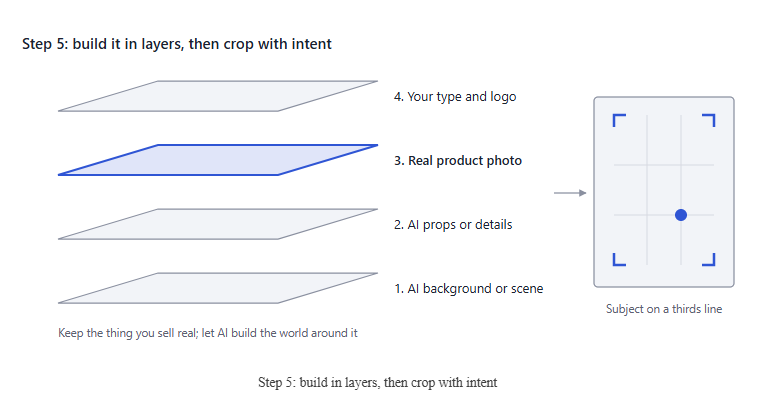
The most convincing “AI” adverts are only partly AI. Photograph your real product on your phone, cut it out, and place it into an AI-generated scene. Customers trust the thing they’re buying looking exactly like the thing they’ll receive.
Then crop. AI tools centre everything, so move your subject onto a thirds line, trim the edges and let one element bleed off the frame. When you composite, match the direction of light and add a soft shadow under the product so it sits in the scene instead of floating on it.
Step 6: Add real-world texture and a consistent grade
AI images are too clean: perfect gradients, no noise, everything sharp and bright at once. Real photos and printed posters have grain, softness and a colour “personality”.
A few small moves in any photo editor (Lightroom, Snapseed, Photoshop or your phone’s built-in editor) remove most of that sheen.
Go gently: the aim is “nobody notices”, not a heavy Instagram filter. You can also overlay a subtle paper or print texture on posters, which makes them feel physical even on screen. Using the same grade and your brand colours on every advert makes the set look like a campaign, and campaigns look human-made.
Step 7: Do the squint test, then run the checklist
Shrink your advert to the size it will appear in a phone feed, then squint or blur it. A good advert still shows one clear headline and one clear subject. AI images often turn to busy mush at this point because they’re full of detail nobody asked for.
Finally, show it to someone who hasn’t seen it and ask what it’s advertising, not whether it looks like AI. If they answer quickly, you’re done. Before you publish, tick off the list:
- Made from a written brief, at the right size and ratio
- Prompt describes light, lens and setting, with no “stunning 8k” filler
- Hands, edges, skin and background text checked and fixed
- All words set by hand, no more than two typefaces, not centred by default
- Real product and real logo in the image
- Cropped off-centre with deliberate empty space
- Saturation and sharpness toned down, fine grain added
- Passes the squint test at phone size
The finished example
Here’s what all seven steps look like together, on a poster for a (fictional) neighbourhood bakery.
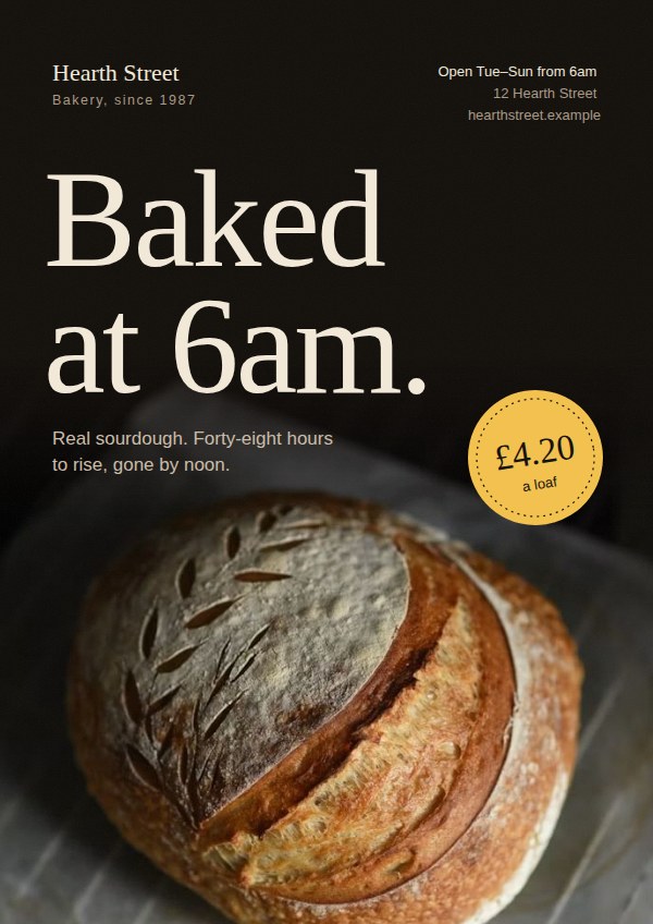
Notice what it does: a single message (“Baked at 6am.”), two typefaces set by hand and aligned left, a real photo of real bread fading up into the dark so the headline has room, a restrained palette, and fine grain over the top. The practical details (price, hours, address) sit where a real shop would put them. Here the loaf is a stock photo; in your version, step 5 would swap in a photo of your own bread.
Bonus: event posters for social media
Scroll any local events page and you’ll see the same poster over and over: a glowing title, a crowd of silhouettes with their hands up, light beams and a purple-orange sky. Quiz nights, craft fairs and gigs all end up looking identical, so none of them stands out.
The steps above still apply, but event posters have their own traps. This is the look to avoid.
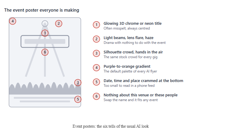
The real problem is point 6. A good event poster could only be for your event: your venue, your people, your date. Everything below is about getting that back.
Event step 1: Make the information the design
Someone scrolling gives your poster about a second. In that second they need four answers, in this order: what it is, when, where (and how much), and what to do next. AI posters get this backwards, spending all the space on atmosphere and squeezing the facts into a strip at the bottom.
Write those four lines first, then design around them. On a type-led poster, the date or the event name can be the image.
Event step 2: Design for the feed, not a noticeboard
Make two versions from the start: a 4:5 feed post (1080 x 1350 px) and a 9:16 story (1080 x 1920 px). In stories, the account name at the top and the reply bar at the bottom cover roughly the first and last 250 px, so keep your text in the middle.
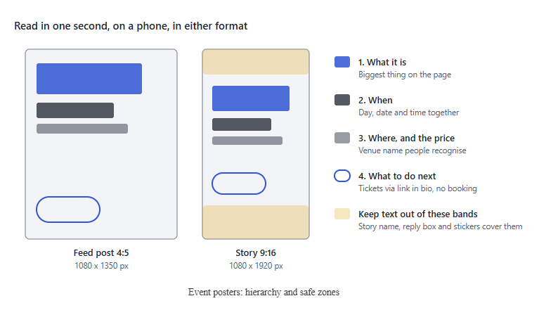
Check it at actual phone size. If the date isn’t readable at thumbnail size, make it bigger and cut something else.
Event step 3: Use one real idea instead of a generic crowd
Pick a single idea that could only belong to this event. A photo of the actual venue, last year’s crowd, the band’s own press shot, or one object that sums it up (a pint glass for a pub quiz, a record for a vinyl fair). If you have none of those, go type-led: huge date, bold colour, nothing else.
If you do use AI, use it for a background texture or a single prop, then follow steps 3 to 6 above. Ban the words “epic”, “neon”, “cinematic” and “crowd” from your prompts.
Event step 4: Build a template, not a one-off
Regular events (monthly quiz, weekly open mic, a festival line-up) should share one layout: same grid, same typefaces, same logo position. Change only the colour, the date and the image. After three or four posts, people recognise yours before they read it, which is exactly what the identical AI posters can’t do.
Event step 5: Let the caption and alt text do the work too
Repeat the key details in the caption: what, when, where, price and how to book. Add alt text describing the poster (on Instagram it’s under Advanced settings when you post). It helps people using screen readers, and it means your details are searchable text rather than pixels.
The finished example: an event poster (Looks better with a real photorgraph in the foreground)
Here’s a 4:5 feed poster for a (fictional) night market, built with the five event steps.
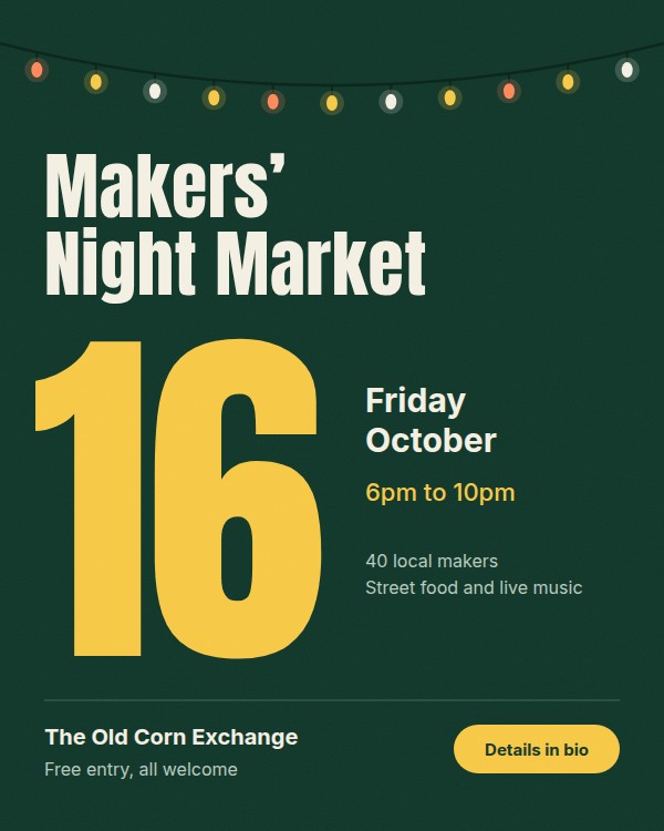
The date is the hero and readable from across the room. The only picture is a string of festoon lights, which says “evening market” in a way a silhouette crowd never could. All four answers (what, when, where and price, what next) sit in their own clear spot, and there’s no glow, no gradient and no lens flare. Swap the colour and the date and it becomes next month’s poster.
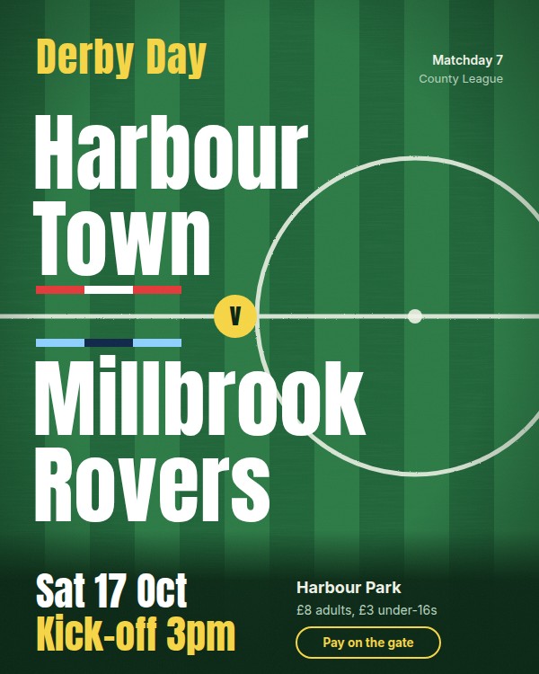
The pitch itself is the image: mown stripes, the halfway line and the centre circle, pushed off to the right and cropped by the edge. The two club names sit either side of the halfway line, like the teams at kick-off, each with a scarf stripe in its kit colours. Date, kick-off, ground and prices sit in a clear footer, readable at phone size. For the next fixture, change the away team and its colours, and it’s done.
The hack: copy-and-paste prompts
These prompts build every step above into one go. Replace each [BRACKETED PLACEHOLDER] with your own details (examples are after “e.g.”), delete the examples, and paste the result into your image tool. Each one asks for no text, so you add your words yourself afterwards (step 4).
1. Product or advert poster
Editorial product photograph of [PRODUCT, e.g. a sourdough loaf] on [REAL SURFACE, e.g. a flour-dusted oak counter] in [SETTING, e.g. a small bakery kitchen]. [TIME OF DAY, e.g. early morning] light from [DIRECTION, e.g. a window on the left], soft natural shadows. Shot on a [LENS, e.g. 50mm] lens at f/2.8, [FILM STOCK, e.g. Kodak Portra 400] colour, fine film grain. [PRODUCT] placed [POSITION, e.g. in the lower right third], with plain empty space [WHERE, e.g. across the top half] for a headline. Muted, true-to-life colours, small natural imperfections. [ASPECT RATIO, e.g. 4:5 vertical]. No text, no lettering, no logos.
2. Event poster with a real scene
Documentary-style photograph of [VENUE OR SCENE, e.g. a village hall set up for a quiz night], with [DETAILS THAT MAKE IT REAL, e.g. trestle tables, answer sheets and paper bunting]. [TIME, e.g. evening], lit by [REAL LIGHT SOURCE, e.g. warm ceiling lights], shot on a 35mm lens, natural colour, visible film grain. Wide shot with [EMPTY AREA, e.g. the top third] kept plain and uncluttered for text. [ASPECT RATIO, e.g. 4:5 vertical]. No text, no signs, no logos, no crowd silhouettes, no lens flare, no light beams.
3. Type-led event poster background
Flat, straight-on photograph of [TEXTURE, e.g. recycled card / painted brick wall / worn felt] in [COLOUR, e.g. deep forest green], even soft lighting, no shadows, subtle natural texture and small imperfections. Plain and uncluttered, to be used as a poster background. [ASPECT RATIO, e.g. 9:16 vertical]. No text, no objects, no gradient, no glow.
4. Sports match poster
Top-down aerial photograph of a [SPORT, e.g. football] pitch at [GROUND TYPE, e.g. a small non-league ground], freshly mown [STRIPE DIRECTION, e.g. vertical] stripes, crisp white line markings. [LIGHT, e.g. flat overcast afternoon light]. The [PITCH FEATURE, e.g. centre circle] sits [POSITION, e.g. right of centre, partly cropped by the edge]. Realistic grass texture, muted natural greens, no players, no crowd. [ASPECT RATIO, e.g. 4:5 vertical]. No text, no logos, no stadium lights, no lens flare.
5. Fixing one detail (inpainting)
Select just the problem area in your tool’s edit or generative-fill mode, then use:
Regenerate only the selected area: [WHAT IT SHOULD BE, e.g. a hand holding a coffee cup] with [CORRECT DETAIL, e.g. five fingers and a relaxed grip]. Match the existing light direction, colour and film grain exactly. No text.
Generate four to six versions of each, pick the least “perfect” one, then carry on from step 3.
The takeaway: use AI for the draft, not the decisions
Adverts look “AI” when the AI made every decision. Brief it properly, direct it like a photographer, fix the tells, set your own type, composite in the real product and finish it by hand. The result is simply good design that happened to use a fast tool.
A quick note on honesty
Making an advert look polished is fine; misleading people isn’t. Don’t use AI to show a product doing something it can’t, invent customers or testimonials, or create fake photos of real people. Some platforms, such as Meta and TikTok, ask you to label realistic AI-generated content, and UK advertising rules still require ads to be accurate. Check the rules for wherever you’re posting, and when in doubt, disclose


 Data: Promptwatch citation tracking; independently verified by Suganthan Mohanadasan (16–20 Aug 2026).