Ever wondered how Google turns your lovingly handcrafted website into a ranking somewhere below a Reddit thread from 2013? It’s not magic, it’s just a long queue of tiny robot librarians fetching HTML, executing JavaScript, and occasionally having nervous breakdowns when they hit your React app.
This is the life cycle of a webpage inside Google’s digestive system: crawl, render, index, panic. Let’s go step by step before your sitemap starts crying.
1. Crawling: getting the raw HTML
1.1 URL discovery & crawl queue
Googlebot first has to discover your URLs. That can happen via:
- Links from other pages
- XML sitemaps
- Manual submit / “Inspect URL → Request indexing” in Search Console
- Other Google systems (e.g. feeds, previous crawls)
Discovered URLs go into a crawl queue with priority based on things like page importance and your site’s crawl budget.
1.2 robots.txt and basic checks
Before requesting the URL, Googlebot:
- Fetches
robots.txt - Checks if the URL (and key resources like JS/CSS) are allowed
- Applies host load limits and crawl budget rules
If the page or important JS/CSS files are blocked in robots.txt, Google:
- Won’t crawl them
- Won’t be able to fully render your JS content later
Practical implication: Never block
/js/,/static/,/assets/, etc. inrobots.txt.
1.3 Fetching the HTML (“first wave”)
Googlebot makes a normal HTTP request (like a browser without UI):
- Gets the initial HTML (without having run JS yet)
- Parses head tags (title, meta description, canonical, meta robots, hreflang, etc.)
- Extracts links from the HTML and adds them to the crawl queue
- Notes references to resources (JS, CSS, images)
At this stage, only what’s in the raw HTML is visible. If your content is 100% client-side rendered (React, Vue, etc.), Google might see almost nothing yet.
Google can sometimes do basic indexing directly from the HTML (e.g. if content is already there), but JS-heavy pages need the next phase.
2. Rendering: running your JavaScript
Google describes the JS pipeline as: Crawling → Rendering → Indexing. Rendering happens in a separate system using an evergreen version of Chromium (a headless Chrome kept relatively up-to-date) called the Web Rendering Service.
2.1 The render queue (“second wave”)
After the initial crawl:
- Google adds the page to a render queue.
- When resources allow, that queue feeds URLs into the rendering system.
- Until rendering happens, Google only “knows” what was in the raw HTML.
This is why people talk about “two waves of indexing” for JavaScript:
- Wave 1: Index from HTML (if possible)
- Wave 2: Index updated content after JS has run
Modern research suggests the process is smoother and faster than years ago, but there is still a render queue and potential delay for JS content.
2.2 How Google’s renderer behaves
When a page reaches the renderer:
- Google loads it in an evergreen Chromium environment (no UI).
- It fetches JS, CSS, and other resources (subject to robots.txt, CORS, etc.).
- It executes JavaScript for a limited amount of time (shorter than a user session).
- JS can:
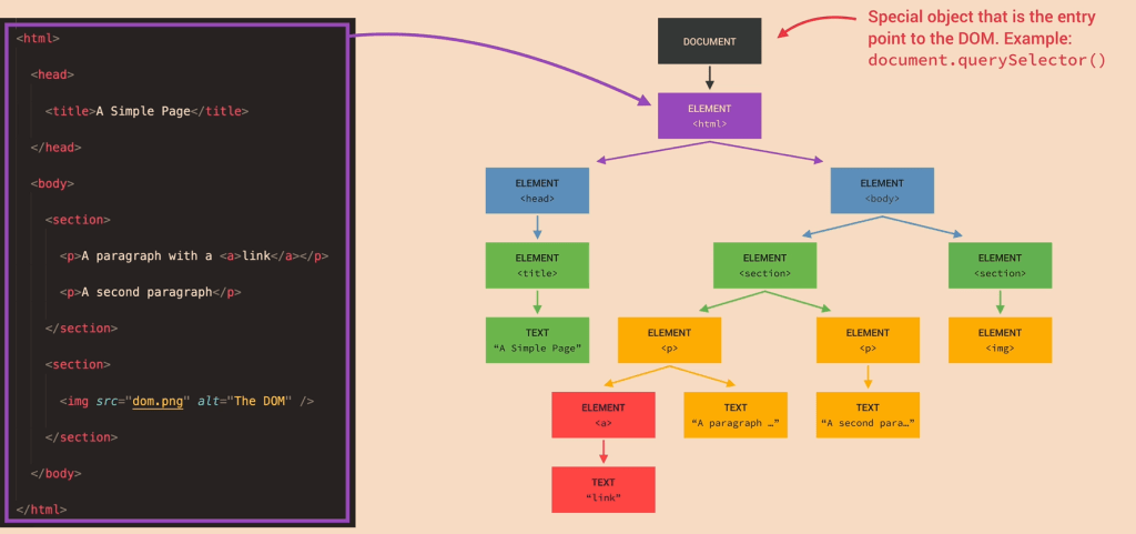
- Modify the DOM
- Inject content
- Fetch JSON/XHR/data and add it to the page
- Add structured data (
application/ld+json) dynamically
Important constraints (from Google’s docs & tests):
- No user interactions: Google doesn’t click, type, or scroll like a user.
- Time limits: Long chains of async calls may never complete before the renderer stops.
- Resource limits: Heavily blocking scripts or endless network calls can break rendering.
- “Noindex = no render” effect: If a page is
noindex, Google generally won’t bother rendering it.
2.3 Post-render snapshot
Once JS finishes (or time runs out), Google:
- Takes the final DOM snapshot (what a user would see after JS).
- Extracts:
- Visible text content
- Links added by JS (e.g. SPA navigation)
- Structured data present in the DOM
- Meta tags if they are changed or added by JS
This rendered snapshot is what feeds into the real indexing stage.
3. Indexing: storing & scoring the rendered content
With the rendered HTML/DOM in hand, Google moves to indexing.
3.1 Understanding the content
From the rendered DOM, Google:
- Tokenizes and stores text (words, phrases, headings).
- Maps entities, topics, and relationships.
- Reads links (anchor text + target URL) added by your JS navigation.
- Parses structured data (schema.org, etc.) that JS may have injected.
This is the version of the page that can now rank for queries matching that content.
3.2 Canonicals, duplicates & signals
Indexing also handles:
- Canonical selection (HTML tags, redirects, link signals).
- Duplicate / near-duplicate detection, especially if JS rewrites similar pages.
- Applying meta robots and HTTP headers from the final state after JS (for most cases).
If Google decides another URL is the canonical, your rendered JS content might be stored but not shown as the main result.
3.3 Final result: searchable document
After indexing, the document is:
- Stored in Google’s index with:
- Content (from rendered DOM)
- Links
- Structured data
- Various quality & relevance signals
- Ready to be retrieved and ranked when a user searches for related queries.
4. Where JavaScript sites usually break this flow
Because JS adds extra moving parts, a bunch of things can go wrong between crawl → render → index:
- Blocked JS/CSS in
robots.txt
Google can’t render layout or content if the files are disallowed. - Content only after interaction
If key text appears only after a click/scroll or in a modal that never opens, Google won’t see it. - Too slow or broken rendering
Heavy JS, long waterfalls, or failing XHR calls mean the DOM never contains the content when Google takes the snapshot. - Infinite scroll / SPA routing without proper URLs
If content is loaded endlessly on one URL without crawlable links or pagination (e.g. no?page=2, no anchor links), Googlebot may only see the initial “page”. - Client-side only structured data that doesn’t materialise in time
If JS injects JSON-LD but too slowly (or fails), rich results won’t trigger.
5. How to see what Google sees (JS-specific)
To understand how your JS is being processed:
- Use URL Inspection → “View crawled page” & “Screenshot” in Search Console to see the rendered DOM.
- Compare “HTML” vs “Rendered HTML” to spot what content only appears post-JS.
- Use “Test live URL” if you suspect render-queue delay.
- Check Coverage / Pages report for “Crawled – currently not indexed” patterns that often show render/index issues.
So there you have it — from lazy bots fetching half your HTML to a headless Chrome pretending to be a real user for 0.3 seconds. Somewhere in that chaos, your content might actually get indexed.
If your JavaScript site isn’t showing up, don’t blame Google just yet — try unblocking your own files and giving the crawler half a chance. Think of it as SEO mindfulness: eliminate obstacles, breathe deeply, and let the bots eat your content in peace.
Explained in simpler terms – How Googlebot Crawls Javascript –
Stage 1 – Discovery & Crawling: “Finding your page and grabbing the first copy”
1. Google finds your URL
Google finds pages from things you already know:
- Links on other sites
- Your internal links
- Your XML sitemap
- Stuff you submit in Search Console
It puts those URLs in a big to-do list (crawl queue).
2. robots.txt check
Before visiting a URL, Google checks your robots.txt file:
- If the page or important files (JS/CSS) are blocked, Google is basically told: “Don’t look here.”
- If they’re allowed, it moves on.
Simple rule for you:
Never block your JS/CSS folders in robots.txt.
3. Google downloads the HTML (Wave 1)
Google now requests the page, just like a browser:
- It gets the basic HTML (before any JavaScript runs).
- From that HTML it grabs:
- Title, meta description, canonical, meta robots, etc.
- Any plain text that’s already there
- Links to other pages
- Links to JS/CSS/images
At this point, Google has not run your JavaScript yet.
If your important content is already in the HTML (e.g. server-side rendered), Google can often index it right away from this “first wave”.
Stage 2 – Rendering: “Actually running your JavaScript”
Now Google needs to know what your page looks like after JS runs – like a real user would see it.
Because this is heavy work, Google doesn’t do it instantly for every URL.
4. Render queue (waiting line)
After the first crawl, JavaScript pages go into a render queue:
- Think of it like: “We’ve saved the HTML. When we have time, we’ll come back and run the JS.”
So for a while, Google might only know the bare HTML version of your page.
5. Headless Chrome renders the page
When your page reaches the front of the queue, Google loads it in something like Chrome without a screen (headless browser).
This browser:
- Downloads JS/CSS (if not blocked)
- Executes the JS for a short amount of time
- Lets JS:
- Change the DOM (the page structure)
- Insert more text
- Add more links
- Inject structured data (JSON-LD)
Then it takes a snapshot of the final page – the “after JS” version.
This is basically:
“What a user would see if they opened your page and waited a bit.”
6. Things that can go wrong here
This is where JS sites often break:
- Blocked JS/CSS → Google can’t see the layout or content properly.
- Very slow JS → content appears after Google stops waiting.
- Content only after a click/scroll → Google doesn’t usually click buttons or scroll like a human.
- Broken scripts / errors → content never appears at all.
Result: Google’s snapshot may miss your main content.
Stage 3 – Indexing: “Filing your page in the library”
Now Google has:
- Version 1: HTML-only (first wave)
- Version 2: Rendered DOM (after JS runs)
7. Understanding the rendered page
From the rendered snapshot Google:
- Reads all the visible text
- Sees headings and structure
- Follows any extra links added by JS
- Reads structured data (schema)
- Applies canonical tags / meta robots, etc.
This updated information is used to update your page in the index (second wave).
8. Search results
When someone searches:
- Google looks through its index of pages (which contains that rendered version).
- It decides which pages are most relevant.
- It shows your URL in the results.
- When the user clicks it, they go to your live site, not to Google’s stored copy.
Quick “JS SEO” checklist for you
If you remember nothing else, remember these:
- Can I see my main content in the raw HTML?
- If yes → you’re mostly safe (e.g. SSR or hybrid).
- If no → you’re relying heavily on rendering; be extra careful.
- Are JS & CSS allowed in
robots.txt?- They should be.
- Does important content require a click/scroll?
- Try to have key text and links visible without interaction, or use proper URLs for loaded content.
- Is the page reasonably fast?
- If it takes ages for content to appear, Google may bail before seeing it.
- Use Search Console’s URL Inspection → “View crawled page”
- Compare:
- HTML Google saw
- Rendered HTML
- If you don’t see your text in the rendered version → that’s a problem.
- Compare:

