
| Dev | ChatGPT |
| Usually an arrogant prick with God complex | Is God, or will be |
| Makes you feel like a thick bastard | Very polite |
| Makes you feel like you’re an annoyance | Always happy to help |
| Hates SEO/PPC | Loves everyone – or acts like it anyway |
| Costs about £4k a month to employ | Pro version costs about £10 a month |
| Gets angry at follow up questions | You can ask unlimited follow up questions |
Category: html
Responsive Images with Inline CSS
Use width in pixels for desktop size and then add max-width:100% so it can’t go wider than mobile viewport:
<div class="content-item brand-space-top-small" style="margin-bottom:1.7rem;">

    <img src="https://nwscdn.com/media/wysiwyg/buyersguide/US_goal_sizes.jpg" style="width:1000px; max-width: 100%;" alt="US Soccer goal sizes" />

  </div>
Aligning Text to the side of an image – with inline CSS and HTML
Had to do this using inline styles to override stuff in the stylesheet etc
<div class="responsive-container" style="display: flex; flex-wrap: wrap; align-items: flex-start; margin-top: 0px; margin-bottom: 0rem;">
  <div class="text-container" style="flex: 1; min-width: 0; margin-right: 20px;">
    <h3 style="margin-bottom: 0.4rem;">FIFA Basic</h3>
    <p>
      Gyda nod ansawdd FIFA Basic, mae Pêl-droed Clwb FORZA yn opsiwn cost-effeithiol ar gyfer timau pêl-droed o bob lefel ar gyllideb. Ar gael mewn meintiau 3, 4, a 5, mae'r peli hyn yn addas ar gyfer pob oed. Mae'r bledren butyl wedi'i amgylchynu gan chwe phanel wedi'i wasgu â gwres gyda deunydd polywrethan 1.2mm o drwch, i helpu'r bêl i gadw ei siâp ar ôl effeithiau dirifedi, yn ogystal â gwneud y bêl-droed o ansawdd gêm yn gwrthsefyll rhwyg ac yn gwrthsefyll y tywydd ym mhob cyflwr. Mae Pêl-droed Clwb FORZA ar gael mewn pecynnau o naill ai 1, 3, neu 30 pêl, ac mewn dau gyfuniad lliw (Gwyn a Glas neu Gwyn a Phinc).
    </p>
  </div>
  <img class="responsive-image" src="https://nwscdn.com/media/wysiwyg/buyersguide/FIFA-Basic-Logo.png" style="max-width: 100%; flex-shrink: 0; width: 250px; align-self: flex-start;">
</div>

<style>
  @media (max-width: 768px) {
    .responsive-container {
      flex-direction: column;
    }
    .text-container {
      margin-right: 0;
    }
    .responsive-image {
      width: 100%;
      max-width: 100%;
      margin-top: 20px;
      align-self: center;
    }
  }
</style>
Obviously, you probably want to change the parapraph text in the <p> and </p> tags and the header in <h3> tags and the image URL
I couldn’t do it all with inline styles in the end – media query had to be put in <style> tags in the HTML doc.
If you’re using a normal webpage – you want the style tags in the <head>
Table with Responsive Horizontal Scroll Bar – HTML & CSS
This is what I’ve just used.
The table in the <body> on the HTML doc:
<!--table-->
<div class="content-text section" style="padding-top: 0px; padding-bottom: 1vh; margin-top: 1rem; width:870px; max-width: 100%;">
<!--<div class="scroll-container scroll-x">-->
<div style="clear: both;">
<div class="scroll-container">
<div class="content-2 section " style="margin-top: 1px">
<div>
<table class="brand-p1" style= "margin-top: 0px; margin-bottom: 0px; padding-top: 0px; padding-bottom: 0px; text-align: center; border-collapse: collapse; background-color:transparent; font-size: 13px; width:870px; max-width: 100%;">
<tr>
<th colspan="8" style="border: 1px solid #878681;background-color:transparent;font-size: 15px;"><strong>Regulation Lacrosse Ball Dimensions & Properties Recap</strong></th></tr>
<tr style=" border: 1px solid #878681;background-color:transparent; font-size: 14px;">
<th style="border: 1px solid #878681;background-color:transparent;">Width</th>
<th style="border: 1px solid #878681;background-color:transparent;">Radius</th>
<th style="border: 1px solid #878681;background-color:transparent;">Weight</th>
<th style="border: 1px solid #878681;background-color:transparent;">Colour</th>
<th style="border: 1px solid #878681;background-color:transparent;">Material</th>
</tr>
<tr style=" border: 1px solid #878681;background-color:transparent;">
<td style="border: 1px solid #878681;background-color:transparent; ">7.75 - 8 inches (19.69 - 20.32cm)</td>
<td style="border: 1px solid #878681;background-color:transparent; ">2.47 -2.55 inches (6.27 - 6.47cm)</td>
<td style="border: 1px solid #878681;background-color:transparent; ">5.0 -5.25 oz (141.75 - 155.92g)</td>
<td style="border: 1px solid #878681;background-color:transparent; ">White, Yellow or Orange</td>
<td style="border: 1px solid #878681;background-color:transparent; ">Vulcanised rubber</td>
</tr>
</table>
</div>
</div>
</div>
</div>
</div>
<!--table--> And then this CSS:
<style>
/* Default - For larger screens */
.scroll-container {
    overflow-x: hidden;
}

/* For screens with a max-width of 600px */
@media screen and (max-width: 600px) {
    .scroll-container {
        overflow-x: scroll;
    }
}
</style>
Float Image to Left & Put Text Underneath – HTML & CSS
If you want to put text underneath an image that “floats” to the left (or right), you can use this code:
<div style="margin-bottom:0;">
    <div style="float: left;">
        <img src="https://nwscdn.com/media/wysiwyg/FORZA/MenHandballSize_Chart2.png" style="width: 700px;" alt="mens & boys handball size by age"/>
    </div>
    <div style="clear: both;">
        text text text
    </div>
</div>
For personal reference, this is the code I need with the correct class for my website:
<div class="content-item" style="margin-bottom:0;">
    <div style="float: left;">
        <img src="https://nwscdn.com/media/wysiwyg/FORZA/MenHandballSize_Chart2.png" style="width: 700px;" alt="mens & boys handball size by age"/>
    </div>
    <div style="clear: both;">
        text text text
    </div>
</div>
Reponsive Table
| USA Goal Post Sizes by Age | |
|---|---|
| AGE | GOAL SIZE |
| UNDER 6/7/8 | 6FT X 4FT (1.8M X 1.2M) |
| UNDER 9/10 | 18.5FT X 6.5FT (5.6M X 2M) |
| UNDER 11/12 | 21FT X 7FT (6.4M X 2.1M) |
| 12+ & SENIOR | 24FT X 8FT (7.3M X 2.4M) |
This code appears to work:
 <!--table-->
 <div style="margin-top: 30px; margin-bottom: 20px; width:570px; max-width: 100%;">
  <!--<div class="scroll-container scroll-x"> -->
   <div style="margin-top: 1px">
    <div>
    <table style= "margin-top: 0px; margin-bottom: 0px; padding-top: 0px; padding-bottom: 0px; text-align: center;     border-collapse: collapse; background-color:transparent; font-size: 13px; width:570px; max-width: 100%;">

   <tr>
     <th colspan="2" style="border: 1px solid #878681;background-color:transparent;font-size: 15px;"><strong>Maximum Goal Post Sizes by Age Recap
</strong></th></tr>
     <tr style=" border: 1px solid #878681;background-color:transparent; font-size: 14px;">
     <th style="border: 1px solid #878681;background-color:transparent;width:25%;">AGE</th>
     <th style="border: 1px solid #878681;background-color:transparent; width:25%;">GOAL SIZE</th>
   </tr>


   <tr style=" border: 1px solid #878681;background-color:transparent;">
    <td style="border: 1px solid #878681;background-color:#f8f8f8;">UNDER 6/7/8

</td>
    <td style="border: 1px solid #878681;background-color:transparent;">6FT X 4FT (1.8M X 1.2M)</td>
   </tr>

   <tr style=" border: 1px solid #878681;background-color:transparent;">
    <td style="border: 1px solid #878681;background-color:#f8f8f8;">UNDER 9/10</td>
    <td style="border: 1px solid #878681;background-color:transparent;">18.5FT X 6.5FT (5.6M X 2M)</td>

   </tr>

   <tr style=" border: 1px solid #878681;background-color:transparent;">
    <td style="border: 1px solid #878681;background-color:#f8f8f8;">UNDER 11/12</td>
    <td style="border: 1px solid #878681;background-color:transparent;">21FT X 7FT (6.4M X 2.1M)</td>
   </tr>

   <tr style=" border: 1px solid #878681;background-color:transparent;">
    <td style="border: 1px solid #878681;background-color:transparent;">12+ & SENIOR</td>
    <td style="border: 1px solid #878681;background-color:transparent;">24FT X 8FT (7.3M X 2.4M)

</td>
   </tr>


  </table>
    </div>
  <!-- </div> -->
  </div>
 </div>

 <!--table-->
Finding & Fixing CSS Spacing Issues with Dev Tools
One of the things I’ve found a bit of a ball ache as a developing developer, is sorting out spacing i.e. padding and margin issues when creating pages using Magento.
For example, let’s say I want to change the spacing above an image.
Best thing I’ve found to do to find the margin or padding that I want to change:
- Right click on image – choose Inspect Element
- In the “styles” tab of dev tools, look for margin and padding styles
In this instance, it’s not the image, or the images div or container that’s causing the spacing that I don’t want:

In this instance, I click on the “Div” or container, that the image resides within (the parent element)
Now I’ve found the issue with the spacing at the top that is too large:

- I can now go into the stylesheet and amend the class “content-image section” or just add an in-line style to this individual incidence of the class, and change “margin-top” to something like 15px.
When you are inspecting an element in Chrome, Dev tools will also tend to highlight (in a dark shade) the spacing around that element too, so it shows you which element is generating the padding or margin.
CSS Transitions for Beginners [2022]

What are Transitions in CSS?
Transitions are used to change the properties or the style of an element.
The transition is kind of like the “animation” that occurs between the two states of the element. Although CSS animations are a different thing. Which is confusing. Sorry.
Transitions and animations are great for grabbing people’s attention (for example in a banner ad) or for enhancing User Experience (UX). In other words, transitions look nice.
Transitions are the bit that happens when an element, like a box for example, changes size to a new state.
Original State —Transition—> New State
Box with 200px width —user clicks to cause transition—> Box with 400px
You might use transitions for example, to dictate how an element changes when it is “hovered” over with a mouse pointer.

With the code above, the element given the class of “box”, will change from 200px width to 400px when someone hovers over it with their mouse.
The code above will have no transition, it will just change from one to the other.

With transition-property and transition duration added, the box will move gradually from 200px to 400px, over the course of 1 second.
Transition-duration can be set in ms (milliseconds) or seconds in CSS, but Javascript, only uses ms.
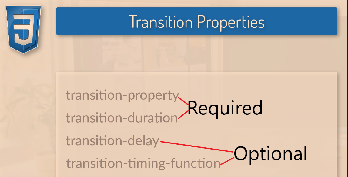
Transition Properties
To create a CSS transition, you need to specify the transition-property and the transition duration.
The transition-property dictates, what is going to change, for example, the width and height:
transition-property: width, height;The transition duration dictates the length of time a transition should take, e.g.
transition-duration: 2s;
Transition-delay, specifies how long a transition should take to being, and transition-timing-function dictates how fast and slow the transition should occur (more info below).
CSS Transition Examples
In the example below, the box is given a class of “box” inside the HTML.
In the CSS sheet, this class is selected with the dot/period/fullstop – “.box” and given styles that include 300px height and width.
Here the box is also given the transition-duration of 350ms and the transition-property style states that the background is what will change.
The .box:hover dictates how the style will change when the box is hovered over with a mouse pointer. In the example, it will rotate 45 degrees and change colour.
The
transition-propertyproperty specifies the name of the CSS property the transition effect is for (the transition effect will start when the specified CSS property changes).Tip: A transition effect could typically occur when a user hover over an element.
Note: Always specify the transition-duration property, otherwise the duration is 0, and the transition will have no effect.
https://www.w3schools.com/cssref/css3_pr_transition-property.php
Here’s a real-life example of a transition:
You can just write “all”, but best-practice is to state all of the properties you want to change with your transition:

Transition-Timing-Function
By default, your transitions will “ease” into the new styles.
ease
Ease is the default value. Ease increases in velocity towards the middle of the transition, slowing back down at the end.
linear
Transitions at an even speed.
ease-in
Starts off slowly, with the transition speed increasing until complete.
ease-out
Starts transitioning quickly, slowing down the transition continues.
ease-in-out
Starts transitioning slowly, speeds up, and then slows down again.cubic-bezier(p1, p2, p3, p4)
Cubic-Bezier
If you really want to, you can also define your own transition speeds using cubic-bezier. The easiest way to do this is to use a generator.

Testing Transitions with Chrome Dev Tools
You can “visualise” transitions, using Inspect Element/Chrome Developer Tools and clicking on “ease” or the transition-property you’ve created/stated:

You can also play around with rotation
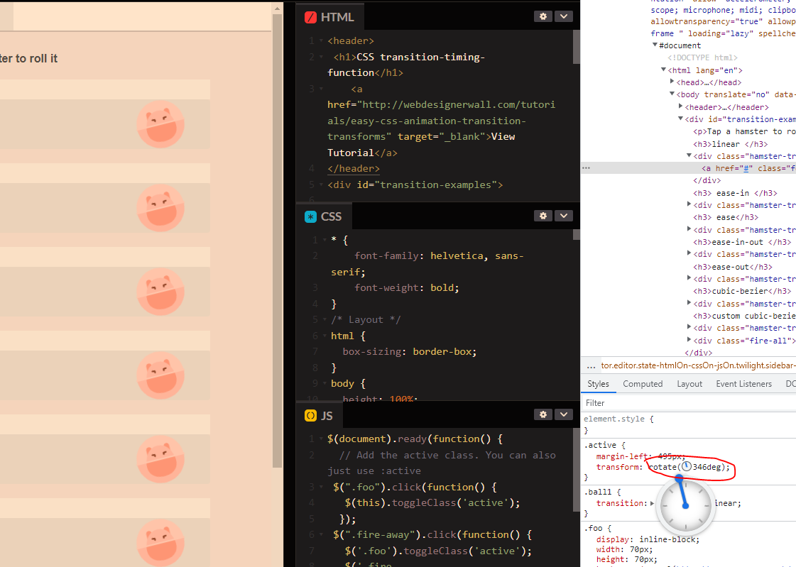
Remember to copy the code before you exit Chrome dev tools.
Warning about CSS Transitions
If you can limit transitions to transforms and opacity.
A browser can use a graphics card for transforms and opacity.
For other transitions, you can create transitions which will look strange and very jerky for some users. This is especially true if you set the transition-property to “all”, rather than specific elements.
Be careful when using transitions on box shadows, borders, backgrounds etc.
CSS Positions Explained [2022]

Static
Static is the default position for all the HTML elements.
Static, effectively doesn’t do much, it just means the element like an image or text will follow the normal flow of the page/DOM.
Static elements are a bit shit and kinda lazy, static positioned elements cannot have the z-index, top, left, right, or bottom properties applied to them.
If Static was a TV character, it would be Onslow from Keeping Up Appearances
Static example
Relative Position
Relative positions are pretty similar to static positions, but you can add z-index, top, left, right, and bottom properties to it.
Relative positions go with the normal flow, but can be taken out of the flow (kind of) by adding properties for its position.
Think of relative position like a dog surfer. For no reason at all.
Only joking, because it goes with the flow, but if you shout at it really loudly, you can make it move in specific directions. Maybe.

Absolute Position
Absolute position, removes the element from the normal document flow.
It goes where it wants, regardless of other elements.
The other elements are not moved or effected by an absolute element.
Absolute positioned elements have their width defaulted to auto instead of being full width like a div

https://blog.webdevsimplified.com/2022-01/css-position/
In the above image, the “one” class/element is given 0 for the top and left properties, so it remains in the default position, on the top left of the screen.
Fixed Position
A fixed position in css, is based on the users viewport. A fixed postion element stays in the same place on the users screen, even when the user scrolls.
below is how w3 schools describe fixed positioning:


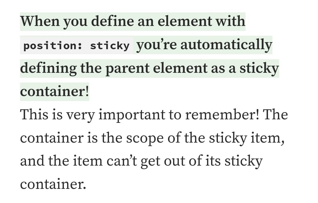
Sticky Positioning
Sticky elements, stick to the users viewport.
Here’s an example, the heading “do you know all about sticky element”:


Block
Block doesn’t appear to be a type of positioning in CSS, but I still see it a lot when looking at code and is kind of related to positioning, so thought I’d better cover it.
Most things are blocks. A paragraph for example is a block.

Block elements always stack on top of one another, even if they have room to go side by side, they don’t.
By default, bock elements have a default of 100% – meaning that they take up the whole width of the page.
The only thing that limits there width, is usually the parent element’s padding or margins.
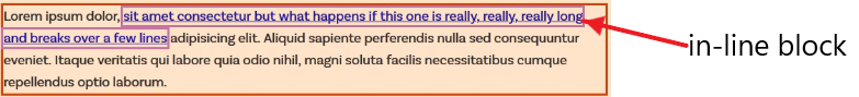
Inline-elements, are a bit different, in that unlike paragraphs etc. they don’t create a new line. For example, a link uses an inline-block element:
You can’t add padding or margins to inline-elements.
Inline-Block
However! You can give margin and padding to an inline-block.
This can be a good block to use, if you don’t want an element, for example a button, to take up the entire width of the page.
For example, if you want to place three buttons in a row, you can use inline-block.

Grid Positioning Example
One final, pratical example of positioning :
CSS Grid with Image and Text Side by Side Example
Here’s another example from css-tricks.com
Grid and flexbox are classed as layouts, rather than positions, which is kind of rubbish (according to my Dunning Kruger opinion) in that you use them to position elements.

CSS Pseudo Classes & Pseudo Elements for beginners [2025]

Pseudo classes – define a special state of an element – for example a:hover (when a mouse pointer is over an element)
Pseudo elements – define the style for a specific part of an element. Pseudo elements use two colons , for example h1::after
Pseudo class examples
a:link pseudo class, defines the normal state of a link – i.e. before someone interacts with it.
a:visited pseudo class, defines the state of the link text when it has been clicked.
a:hover pseudo class defines what happens to the link text when the mouse hovers over it
a:active psuedo class, defines the text link colour when it is clicked

Drop Down Menu Using Pseudo Classes
One really cool thing you can do with pseudo classes, is to create a drop down menu.
W3 school lets anyone, yes anyone! use drop down classes, to create, well, drop down menus. The legends.

In the codepen example above, I just put all this in my HTML, no CSS required. Madness.
<html>
<title>W3.CSS</title>
<meta name="viewport" content="width=device-width, initial-scale=1">
<link rel="stylesheet" href="https://www.w3schools.com/w3css/4/w3.css">
<body>

<div class="w3-container">
  <h2>Dropdown Button</h2>
  <p>Move the mouse over the button to open the dropdown content.</p>
  <div class="w3-dropdown-hover">
    <button class="w3-button w3-black">Hover Over Me!</button>
    <div class="w3-dropdown-content w3-bar-block w3-border">
      <a href="#" class="w3-bar-item w3-button">Link 1</a>
      <a href="#" class="w3-bar-item w3-button">Link 2</a>
      <a href="#" class="w3-bar-item w3-button">Link 3</a>
    </div>
  </div>
</div>

</body>
</html>
Lists Styles
Apparently, list items are selected using “pseudo-selectors”.
By default lists include bullet points.
Use the – list-style-type property to change the style/numbers etc for each list item.
list-style-type: none – will remove any of the styles from the list – no bullet points or numbers etc.
If you want to style individual list items;
For example – ul li: first child { color:red; } will make the text of the first list item, red.
ul li: nth-child (3) { color:blue; } is another method (it’s actually a “CSS method” in technical terms), that in this case, will color the 3rd list item text blue.
Pseudo Elements
define the style for a specific part of an element. Pseudo elements use two colons , for example h1::after
Pseudo elements can be used to, for example, to style the first letter or line of a specific element
Insert content before a specific element
W3schools have some good info on pseudo elements here.
Some examples in the codepen below:
Before content
h1::before {
content: “this is a before thingy”;
color : green
before psuedo element, will put text before a specific element, there’s also “after”, which as you’ve probably guessed, places the content after the element.
 Small Business Dad