CSS Selectors – A Beginner’s Guide [2025]

Hello, I’m having another go at learning code. I’m an SEO Executive but have been coding quite a few of our SEO-related pages in my day job.

Plan is to do courses on Udemy, then create a blog post about them and do an example. I’ll probably have to do the example on Codepen as I can’t embed code in the free WP blog.


CSS selectors, are used in CSS style sheets to determine what styles to apply to what HTML elements.

In Line CSS (bit chavvy)

  • You can apply CSS inline – i.e. just add it onto an HTML element
  • 
    e.g. <H1 style = "margin-bottom 0px;"
    

    CSS in Script Tags

    • You can add it, somewhere on the HTML doc within <style> </style> tags
    <html>
    <head>
    <style>
      h1 {color:red;}
      p {color:blue;}
    </style>
    </head>


    CSS in an external Style Sheet

    Usually the best solution, is to create a separate Style Sheet


    To do this you need a line of code (or markup) linking the HTML doc to the CSS sheet.


    For example, if you save and name your stylesheet as styles.css:


    <!DOCTYPE html>
    <html>
    <head>
      <link rel="stylesheet" href="styles.css">
    </head>


    Best practice is to put all your styles in a separate stylesheet. Dunno why, just go with it for now.

    If you put your CSS in script tags, or in a stylesheet, you’ll need to use Bo selectors.


    • Imagine you’re a parent.
    • HTML elements are your kids
    • The CSS style sheet are the instructions you’re giving to the baby-sitter on how to look after your kids. 

    Great analogy, I know.

    You can be an overprotective, bit of a bellend of a parent and use inline CSS to give you micro-management and control over your kids, but you generally don’t want to do that.


    Types of CSS Selectors

    ID & Class selectors are the most commonly used. Class selectors for sure. But I’ve listed class selectors second, just to be annoying.


    ID selectors


      • Id selectors use a hashtag, like Twitter but it’s not full of political wankers and Chinese bots – #
      • Use these selectors sparingly, class selectors usually work better/are preferred. 
      • If you run the codepen below, hopefully you’ll see that I’ve selected only the first ID, and made it blue

      • ID selectors are specific and therefore override more general selectors

    Class Selectors

    • The most commonly used type of selector
    • very versatile
    • Well supported in most browsers – probably all browsers except for like IE 6
    • You can add multiple classes to an HTML element, so you can style it multiple ways with a class selector
    • If you run the pen below, you should see the first class coloured pink


    Tag Selectors

    • HTML tags like <h1> and <p> can be targeted directly with tag selectors
    • Tag selectors are sometimes used to unset styles that browsers set by default
    • Tag selectors are not so popular. Stick with class selectors if possible. 
    • Just type the name of the tag e.g. H2 and then open curly brackets, add style and close brackets


    Attribute Selectors

    • The value within your HTML tags is called an attribute
    • You can target them directly with CSS attribute selectors


    Positional Selectors

    – Decent type of selector when trying to style individual elements of a list or div
    – To style the second item on a list – prefix the CSS with “li”:

    li:nth-child(2)


    Here’s a cool CSS Cheat Sheet / infographic


    CSS Cheat Sheet

    CSSslectorsCheatSheet

    Image source


    For a much better tutorial about CSS selectors visit – https://css-tricks.com/how-css-selectors-work/


    Here are some more selectors from the quiz on the CSS Bootcamp course on Udemy
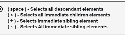


    CSS selectors

    HTML Table Code

    <!--table-->


           <div class="content-text section" style="margin-top: 10px; margin-bottom: 20px;">
    
    <div class="scroll-container scroll-x"> 
    
    
         <div class="content-2 section " style="margin-top: 1px">
        <div class="content-item">


        <table class="brand-p1" style= "margin-top: 0px; margin-bottom: 0px; padding-top: 0px; padding-bottom: 0px; text-align: center;    margin-left: auto;
      margin-right: auto; border-collapse: collapse; background-color:transparent; font-size: 13px; width:100%;
      ">
      <tr>
         <th colspan="4" style="border: 1px solid #878681;background-color:transparent;font-size: 15px;"><strong>Table Example Header


    </strong></th></tr>
             <tr style=" border: 1px solid #878681;background-color:transparent; font-size: 14px;">
     
        <th style="border: 1px solid #878681;background-color:transparent;">Level</th>
        <th style="border: 1px solid #878681;background-color:transparent;">Length (m)</th>
          <th style="border: 1px solid #878681;background-color:transparent;">Width (m) </th>
        <th style="border: 1px solid #878681;background-color:transparent;">Playing Surface </th>
         </tr>


           <tr style=" border: 1px solid #878681;background-color:transparent;">
    
        <td style="border: 1px solid #878681;background-color:transparent;">International


    </td>
        <td style="border: 1px solid #878681;background-color:transparent;">28
    
    </td>
    
     <td style="border: 1px solid #878681;background-color:transparent;">15
    
    </td>
        
        <td style="border: 1px solid #878681;background-color:transparent;">Area elastic wooden	
    
    </td> 


      </tr>
         
      <tr style=" border: 1px solid #878681;background-color:transparent;
    
    
    ">
        <td style="border: 1px solid #878681;background-color:transparent;">Premier
    
    </td>
        <td style="border: 1px solid #878681;background-color:transparent;">26-28


    </td>
         <td style="border: 1px solid #878681;background-color:transparent;">14-15
    
    </td>
        <td style="border: 1px solid #878681;background-color:transparent;">Semi-sprung wooden or synthetic</td>
        
         
      </tr>


           <tr style=" border: 1px solid #878681;background-color:transparent;
    
    
    ">
        <td style="border: 1px solid #878681;background-color:transparent;">Club
    
    </td>
        <td style="border: 1px solid #878681;background-color:transparent;">26-28


    </td>
         <td style="border: 1px solid #878681;background-color:transparent;">14-15
    
    </td>
        <td style="border: 1px solid #878681;background-color:transparent;">Semi-sprung wooden or synthetic</td>
        
         
      </tr>


           <tr style=" border: 1px solid #878681;background-color:transparent;
    
    
    ">
        <td style="border: 1px solid #878681;background-color:transparent;">Community
    
    </td>
        <td style="border: 1px solid #878681;background-color:transparent;">26-28


    </td>
         <td style="border: 1px solid #878681;background-color:transparent;">14-15
    
    </td>
        <td style="border: 1px solid #878681;background-color:transparent;">Semi-sprung wooden or synthetic</td>
        
         
      </tr>


    </table>
         
    
        </div> 
        </div>
         
         </div>
       
         </div>
      
     <!--table-->      

    The code in bold – is for adding a horizontal scroll bar. If a table is too wide on mobile, the scroll bar let’s users slide it across and view all the table’s info and columns

    The code in italics – these are “in-house” CSS classes, that probably won’t work or do anything in your code.

    Add the number of columns to this bit of code near the top:

    • <th colspan=”4

    This is how the above code should look when published:

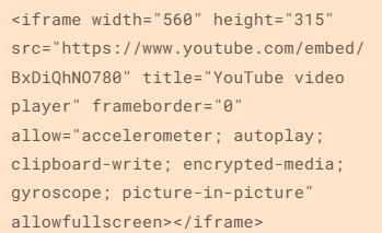
    Responsive Youtube IFrame Embed

    Go to a YouTube video – on YouTube.com

    • Click “Share” then “Embed” and grab the code

    Default Embed Code:

    DEafult Youtube iframe embed HTML code


    I changed the default width="560" at the start to width="100%"
    Also added style="max-width: 600px;" - after allowfullscreen:


    I can’t show an example unfortunately, as my Free WordPress.com blog doesn’t allow to add any code. The embed above isn’t fully responsive.

    Responsive Images with Inline CSS

    This is how I create images that are full width in desktop devices and mobiles etc.

    You just need to use:

    max-width: 100%;
    height: auto;

    Good info here on W3 Schools


                <img src="image-address.png" 
    style="max-width: 100%; margin-bottom:0; max-width:1000px; height: auto;"
             alt="relevant description of image" >
     

    Change the “max-width” to whatever you want the max width of the image to be on a desktop device.

    For personal reference, this is the exact code I need for my own website with pre-built classes:

     <div style= "margin-bottom:20px;" > 
          <div class="content-item">
                <img src="image-url" style="max-width: 100%; margin-bottom:0; max-width:1000px; height: auto;"
             alt="relevant description of image" >
          </div>
      </div>

    Here’s another example that I used today (july 2023!)

      <img src="drews-sexy-image.jpg"  style="width:1000px; max-width: 100%; height: auto; padding-top:25px;" alt="Basketball hoop dimensions" />


    In the code above^ – the image will be 1000px wide on desktop, and the width of the screen on smaller devices

    Padding-top, just puts some white space above the image

    By the way – when you set image sizes to % – this represents the % of the block that the image is contained within