JavaScript – What is the DOM & DOM Manipulation? [2023]

The Document Object Model – is a structured representation of an HTML document.

You can use the DOM to “connect” HTML to CSS and JS.

The DOM is often said to have a tree structure or a hierarchy like a family with children and parents

Image source

Selecting & Manipulating Elements with JavaScript

You can use “document” to ‘enter’ the document – as in the top level of the HTML document as shown in the tree diagram above.

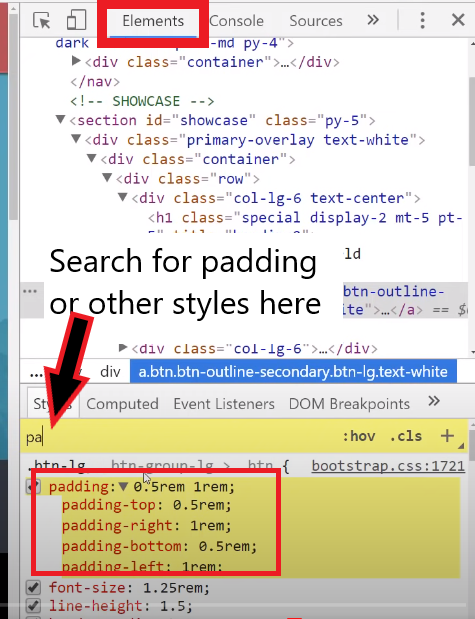
  • use “querySelector” to select a specific element in the DOM.

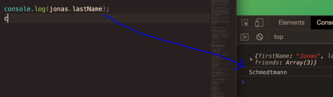
For example document.querySelector(‘.message’).textContent

Will select the text content of the element with the class of “message”

Once you have selected the content, use the equals sign = to update it.

document.querySelector(‘.message’).textContent = ‘Correct Number!’

The ‘code’ on the line above, will change the text-content found in the element .message to “Correct Number!”

“textContent” will only work if the element is something like a paragraph, that holds content.

If you have a value input field, like on a form or something similar, you may have to use .value instead of .textContent

document.querySelector(‘.guess’).value = 23;

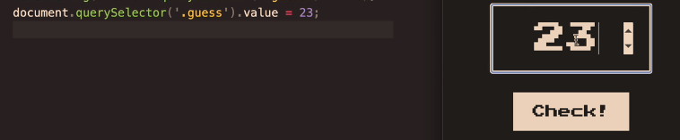
The code on the left, adds “23” as the input value to the form/input field on the right^

Screenshot from The Complete JavaScript Course

Handling Click Events

In this example, the button has a class of “check”

document.querySelector(‘.check’) – will select the button with the class of “check”

Then we need to use the addEventListener() method. The addEventListener method, basically looks out for events such as button clicks.

Image Source

Event Listener ^looks out for events such as button clicks.

We can add the event we want to look out for, in this example a click:

addEventListener(‘click’)

  • Now we need to tell the event listener what to do what it observers a click

addEventListener(‘click’ function () {
console.log(document.querySelector(‘.guess’).value);});

The code in bold, will take the value from the element called “guess” and print it to the “console.log”.

Screenshot from The Complete JavaScript Course

The code above prints 9 to the console.log

the element with the class of “guess” is the form input field containing the number 9:

Adding “Game Logic”

The aim of game in the screenshot above – guess the secret number

We need to randomly create a number and then tell the user when the number they guess is too high, too low or correct.

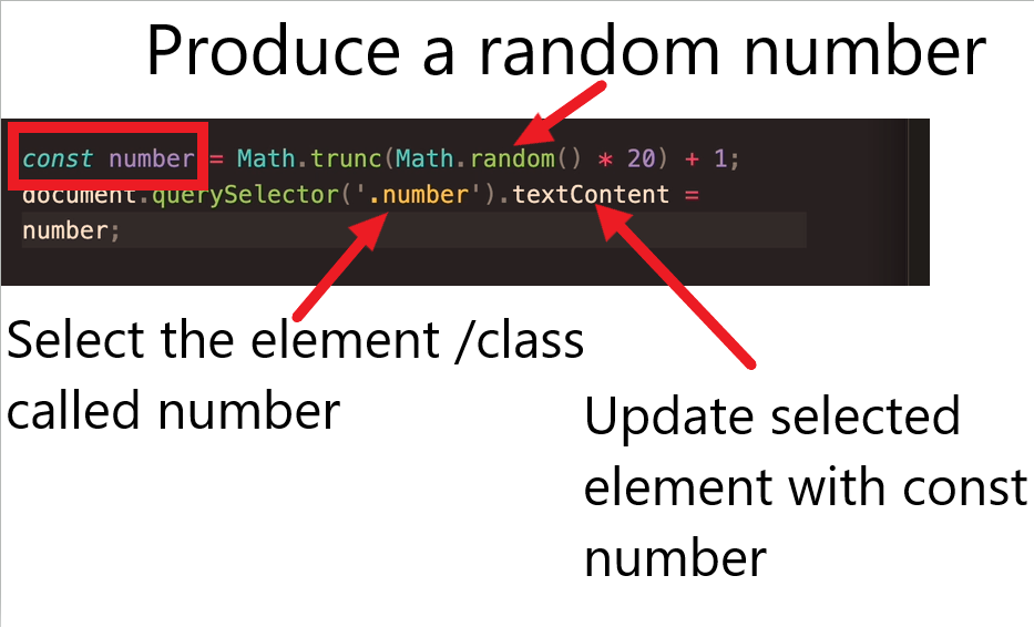
  • Producing the secret number

const number = (Math.truncMath.random()*20)

Math.random gives a number between 0 and 1

Match.trunc rounds up or down the number to the nearest whole number.

Multiplting the random number by 20 makes the number, well, larger

  • Checking the User Input Vs the Secret Number
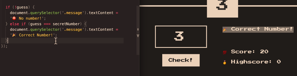
if (!guess) {

document.querySelector(‘.message’).textContent = ‘No Number’;}

else if (guess === secretNumber) {

document.querySelector(‘.message‘).textContent = ‘Correct Number!’;

}

The code above will print “No number” if a number isn’t entered into the relevant form field.

if the number entered (the guess), is equal to the secretNumber – then the code will print “Correct Number!” – to the element with the class of “message“.

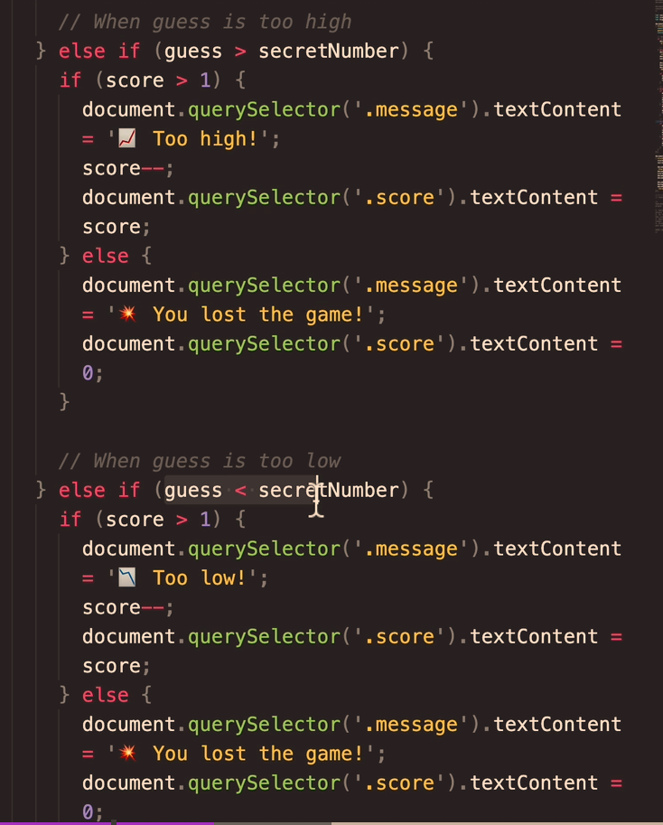
What if the guess is greater than the Secret Number?

else if (guess > secretNumber) {

document.querSelector(‘.message’).textContent=’Too high!’

and if it’s too low:

else if (guess < secretNumber) {

document.querSelector(‘.message’).textContent=’Too low!’

So all the code together will look like:

Adding a Score to The Game

The score will start at 20 and decrease for every wrong guess.

So, if the user guesses too low, reduce the score by 1

We also need to add a variable for the original/starting score, after the secretNumber is declared (or the code to create the secretNumber anyway)

Declare the score with:

let score = 20;

The score is part of the “application state”. The score is available in the code and not just in the DOM

Game Over

To tell the player when they’ve lost the game, we need to add a condition related to the score variable:

if (score > 1) {

https://www.udemy.com/course/the-complete-javascript-course/learn/lecture/22648419#learning-tools

Manipulating CSS When Player Wins- Change Background Colour

First select the whole <body> element

document.querySelector(‘body’).style.backgroundColor = ‘#60347’;

Implementing a High Score ‘Box’

Just like the regular, current score, we need to store the high-score in a variable.

use the code

let highscore = 0;

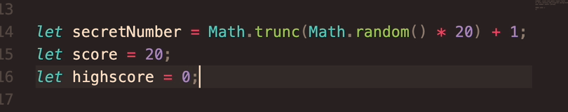
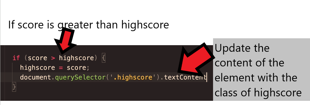
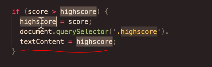
We need to check if the current score is greater than the existing game’s score

if (score > highscore) {

highscore = score;

}

Assuming the “HighScore” Box has already been made – we need to check what the class is.

In the this case, the class = “highscore”

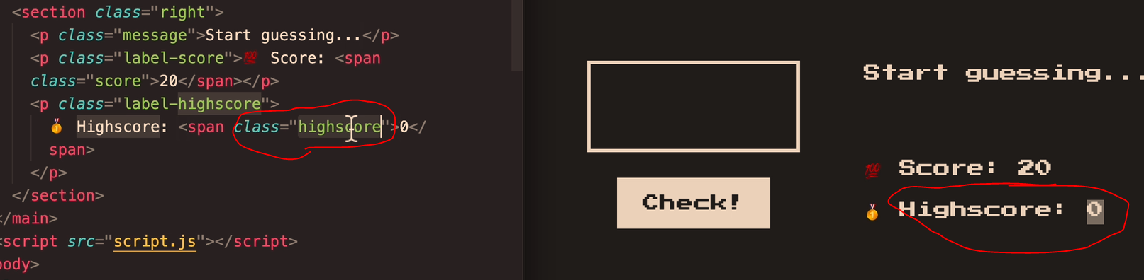
Now we need a way to update the highscore, when the current score is greater.

document.querySelector(‘.highscore’).

textContent = highscore;

https://www.udemy.com/course/the-complete-javascript-course/learn/lecture/22648427#learning-tools

Getting Rid of Duplicate Code (DRY Principle)

The code if the guess is too high, or if the guess is too low code is pretty much duplicate code

Remember

Dont Repeat Yourself DRY

There’s no problem starting out with repeated code, and then refactor the code once it’s all working

  • ID duplicate or close-duplicate code
  • Refactor the facker

Change the code above, to a “when guess is wrong” code block.

Use a ternary operator

What are objects in Javascript? [2023]

Notes taken from the Udemy Course – the Complete JavaScript Course which you can enroll on here.

I’ve also robbed some screenshots from other sites, but linked to them in the “source”.

  • An object is a collection of properties
  • A property is an association between a name (key) and a value
  • A property’s value can be a function (but then it’s called a “method” for some reason)

Source

Objects provide a way to group values together in an organised fashion.

Objects can store lots of different types of data.

Objects can contain variables, functions or both.Variables found in objects are properties, while functions are methods.

In objects we define key-value pairs. The key is also called the “property name”.

Objects are normally declared within culry braces:

firstName is a “key” and the “value” is “Jonas”.

The name and the value, create a “key value pair”.

There are many ways of creating objects in JavaScript.

Using curly braces is called the “object literal syntax” because you’re writing down the literal object.

The order you write down objects doesn’t matter, unlike in arrays.

How do we get data from an object?

Dot Notation

Screenshot source

The first way to access data in an object is to use “dot notation”:

Dot notation is the most popular method to access the properties of an object.

let obj = {
  boxer: 'jab',
  muayThai: 'kick'
};
let strike = obj.boxer;
console.log(strike);
// jab

The dot notation in the example above is – let strike = obj.boxer;

Specify the name of the object, then add a dot, followed by the property name.

The syntax is objectName.propertyName;

Source

Bracket Notation

let obj = {
  boxer: 'jab',
  muaythai: 'kick'
};
let strike = obj['boxer'];
console.log(strike);
// jab

You can read a much better article about dot and bracket notation – here –> codeburst.io or here —> plainenglish.io

How do you create objects?

It is a common practice to declare objects with the const keyword.

There are two methods by which you can create an object: an object literal and the object constructor. 

Source

let’s create an object named myCup and give it properties named color, volume, and weight as follows:

let myCup = new Object();
myCup.color = "transparent";
myCup.volume = 1;
myCup.weight = 0.5;

We can write the same object in a shorter notation. Comma-delimited list of  pairs of property names and associated values, enclosed in curly braces:

let myCup = {
 color: "transparent",
 volume: 1,
 weight: 0.5
}


Above, we declare a variable in the same way with: let myCup equals and then curly brace.

source

If you are making multiple objects, it’s best to use the object constructor.

You can use a constructor to create a new object by calling the constructor with the new keyword. The new keyword will create an instance of an object and bind the this keyword to the new object.

The this keyword is a reference to the object itself.

function Fighter(name, age, nationality) { 
    this.name = name; 
    this.age = age; 
    this.nationality = nationality; 
    this.bio = function () { 
        console.log(`My name is ${this.name}. I'm ${this.age} years old. I'm from ${this.nationality}`) 
    } 
};

const oladele = new Profile("Izzy", 29, "Nigeria" );
console.log(oladele.bio()); //My name is Izzy. I'm 29 years old. I'm from Nigeria

More info about constructors at Freecodecamp.org

Here’s another example, using the this keyword from w3schools

<script>
// Constructor function for Person objects
function Person(first, last, age, eye) {
  this.firstName = first;
  this.lastName = last;
  this.age = age;
  this.eyeColor = eye;
}

// Create a Person object
const myFather = new Person("John", "Doe", 50, "blue");

// Display age
document.getElementById("demo").innerHTML =
"My father is " + myFather.age + "."; 
</script>

The above code gives the output “my father is 50”. (which is printed to the paragraph with the id of “demo”)

Adding a method to an object

We can add a method simply by adding another property that is a function. This function will be able to read the values of the object and work with them.

We will add an example that will print out the color of the table.

myTable.whatIsMyColor = function() {
 console.log("My color is: " + this.color);
};

source

source

Adding a new property to an object

In JavaScript you can add a property to an object after it has been created.

The following statement adds the age property to the fighter object and assigns 22 to it:

fighter.age = 22;


Deleting a property of an object

Simply use the delete operator

delete fighter.age;

Checking if a property exists

To check if a property exists in an object, you use the in operator:

propertyName in objectName

The in operator returns true if the propertyName exists in the objectName.

The following example creates an employee object and uses the in operator to check if the ssn and employeeId properties exist in the object:

let employee = {
    firstName: 'Peter',
    lastName: 'Doe',
    employeeId: 1
};

console.log('ssn' in employee);
console.log('employeeId' in employee);Code language: JavaScript (javascript)

Output:

false
true

Source

CSS Grid for Beginners [2022]

CSS Grid allows you to layout items in 2 dimensions. It is similar to Flexbox but in 2D, instead of 1D (apparently).

You have a grid container, like in Flexbox. It is like a square perimeter around all the items or elements.

Grid has lines or tracks between the elements.

Getting Started with CSS Grid

You’ll want a code editor thingy, like Sublime Text, Visual Studio or if you’re old school, Notepad.

The easiest way to do this is to use codepen, but if you have Visual Studio, that’s ideal as you can test your code in real time.

Unless your using inline styles, you’ll want to create an HTML doc and a separate CSS sheet.

  • Getting started

If you want to follow along, you’ll want to add the <HTML> tags to declare you’re created a webpage with HTML, and add a <head>, a page title in <title> </title> tags and a <body> to add your content.

You should then save the HTML doc as something like “index.html”, just make sure it has .HTML at the end of the name.

In a separate doc/sheet, create your style sheet and save it as “styles.css”

You can then link to/connect your HTML doc to your CSS sheet in the <head> of the HTML doc with the code in bold:

<html>
 <head>
 <link rel="stylesheet" href="styles.css">
 <title>Grid Example</title>
 </head>
 <body>
 
 </body>
</html>
  1. In your HTML, create a container to wrap all your items in.

You can create a div to wrap all your items or elements within*

<div class = "grid-container">

2. You also need a div (or tag of some kind) to put yo grid items in

<div class="grid-item grid-item-1"> </div>
<div class="grid-item grid-item-2"> </div>
<div class="grid-item grid-item-3"> </div>

So now your HTML doc should look something like this:

<html>
 <head>
 <link rel="stylesheet" href="background_styles.css">
 <title>Grid Example</title>
 </head>
 <body>
  <div class = "grid-container">
   <div class="grid-item grid-item-1"> </div>
   <div class="grid-item grid-item-2"> </div>
   <div class="grid-item grid-item-3"> </div>
  </div>
 </body>
</html>

In your Styles.css sheet, you now need to declare the CSS Grid stuff.

.grid container {
 display: grid;
}

The code above just tells CSS lords that you are going to use grid, now you need to style the columns or rows.

We’ll declare the grid column sizes. You can use pixels, rems, percentages and all sorts. Pixels is prob the easiest.

To create a table/grid with 2 columns, the first being 200px wide and the second 100px, use the CSS code:

.grid container {
 display: grid;
 grid-template-columns: 200px 100px;
}

Because we declared 3 grid items in our CSS, the 3rd item will be put onto a second row:

css grid example

CSS Grid Fractions

People like to use “fractions” for CSS columns. Keeps things relative and simple.

.grid container {
 display: grid;
 grid-template-columns: 2fr 1fr;
}

The code above, would produce the same output as the first example.

we’ve used a total of 3fr’s. 2 thirds are used to set the width of the first column, and 1 third for the final column.

CSS Grid Repeats

If you wanted to have 4 columns, all 100px wide, instead of typing 100px out x 4, you can just use the repeat command (

.grid-container {
  display: grid;
  grid-template-columns: repeat(4, 100px);

CSS Grid Auto-Rows

If you don’t know how big your table or whatever will be, you can use:

grid-auto-rows: 150px;

Now, all the rows that are created, will be 150px tall

If you want to make sure you content, copy or images or whatever, fit in the rows, you can use the MinMax thing.

grid-auto-rows: minmax (150px, auto);

CSS Grid Gaps

If grid is a table, then the gaps are the thicknesses of the lines of the table.

You can use “grid-gap: 10px;” to set both the row and column gap width, or

grid-row-gap: 20px;
grid-column-gap:10px;

To set the row gaps to 20px and the column gap to 10px.

Grid template areas

You can name and define different rows with “grid template areas”

CSS sheet


.grid-container {

grid-template-areas:
 
   "header header"
   "sidebar content"
   "sidebar content"
   "sidebar content"
}

More info here – https://www.w3schools.com/cssreF/tryit.php?filename=trycss_grid-template-areas3

The video should start at the grid template areas section:

Grid Alignment

Works similar to flexbox when it comes to aligning items.

  justify-content: center;

justify-content: center; will place all the items in the middle of the page

Centred Grid

To place the content to the left:

  justify-content: start;
justify-content: space-evenly;

Space-evenly, will spread the grid items evenly across the page:

*Everyone tends to use divs, but according to W3 (the internet police) you should be using divs as a last resort. More info here

Instead of <div class =classname>, you could for example, use <article class=”classname”> or <section class = “classname”>

***Remember to add specific styles to the .grid-container in the CSS sheet, and text-specific styles, such as text-align, in the grid.item styles section***

E.g. put this in the .grid-item styles, not the .grid-container:

.grid-item {
background: green;
text-align: center;
}

Styling a Single Grid Item

Let’s say you have made a grid, with 6 items, but you want the first one to be different to the rest. Probably the easiest way to achieve this, is to add a “.grid-item-1” styles section, below the CSS you’ve created for the rest of the grid items.

CSS Grid Layout Generator

The Grid Layout Generator that I find easiest to use, is the try it yourself grid layout tool on w3 schools – https://www.w3schools.com/css/tryit.asp?filename=trycss_grid

I find it easier, as the HTML and CSS is divided nicely to .grid-container and .grid-items.

I made this by copying and pasting the code from the W3schools try it yourself grid tool and adding column and row gaps.

If you use the W3 try it yourself tool, remember to click “Run” on the top left, as the code doesn’t update real time.

css grid equal height rows

If you add the value/property thing in CSS, to the .grid-container section of the CSS (assuming you’ve named the class of your container .grid-container) to “grid-auto-rows: 1fr;” – then all the rows should be equal height. Or you could just set the heights to 100px each

css grid background color

In this codepen example, the line

 background-color: #2196F3;

sets the background colour to blue.

How to use Inspect Element in Chrome [Dev Tools]

I’ve made some notes on how to use the Inspect Element Tool – AKA Chrome Developer Tools.

Sorry about the change in layout for the images, I drafted this post on various computers and devices and used different software to annotate the screenshots.

The main thing that I use inspect element for at the moment, is to work out what’s cuasing

finding white space issues with dev tools

To launch Inspect Element right click and from the drop-down menu that appears, click “Inspect” at the bottom.

When you hover over any element, such as a H1 in the inspect-window, the element will also be highlighted in the view of the webpage.

  • The small horizontal bar shows the location of the element you’re hovering over or selected

Elements > Styles Tab

The styles tab, shows you the styles, or CSS for any element you’re hovering over on the webpage.

You can turn styles off and on, using the check box

on the opposite side of the style, it shows the location, or path of the CSS file

  • I use this tab a lot to find out where spacing i.e. margins and padding is coming from – if it’s not from the individual element, that I can click on the container (usually a “div) and check the marings and padding values on that.

  • You can also turn CSS styles on and off – a checkbox will appear next to each style when you hover over it
  • Right click – copy element – and you can paste headers, images etc into another location on the page
  • You can click & drag elements too

You can also search for specific styles using the box shown below:

search for styles in inspect element

-Computed Styles Tab

Computed styles, are the result of all the CSS in the Styles tab.

You can also clock the + icon to the right of .click, to add a new style to the elements tab. Remember to copy the css if you want to keep itz or you’ll lose it when you refresh the page.

You can use the horizontal box near the middle to search for styles and elements

inspect element search

– Forced Element State

With the Forced Element State menu open, you can tick different boxes and check how an element appears – for example a link, when it’s been clicked, or hovered over with the mouse.

– Console Tab

I’ve never got my head around this tab, but here goes.

  • In the console tab, you can see all the Javascript and console log messages
  • Can use it to check code is working, for example any “if/else” code, you can check which “option” your code took
  • You can also see error messages

According to one of the tutorials I’ve read, this works best when running a code tool like Visual Studio. You can link up Visual Studio and test out your Javascript code real time.

  • Refresh the page whilst you have the Console Tab open, you can check the console tab for any error messages
  • You’ll likely get a load of error messages if you have an Ad Blocker extension
  • You’ll get warnings and “violation” messages in yellow if you are using out of date frameworks or libraries e.g. JS
  • The “no entry” icon will clear the console messages

The two Youtube tutorial below, should start at the sections talking about the Console tab:

  • You can run your own JS in the console tab. For example type “alert(1)” and click enter, you’ll get a pop up with the text “1” within it
  • If you type in code, the line below will usually give you the return value.
    E.g. if you type “1+3” the return value will be “4”
  • “undefined” means there is no return value
  • $0 will return the last item you selected, $1 returns the second to last item you selected, $2 the third to last, etc.

console code inspect dev tools

Editing HTML in Visual Studio or another Code Editor

  • You can also type code into the “webpage window” to the left, in this example:

**You will probably have to refresh the page to see the code output if you don’t have a visual studio plugin**

Network Tab

In this tab, you can see every element, and when it has been loaded

Using the “time bar” at the top, you can click and drag over different time periods and see what loaded.

For example, you can see what took the longest to load

  • You may have to refresh the page for this to work ‘properly’

Sources Tab

In the sources tab, you can navigate different files related to the webpage.

If you are on the homepage, clicking “index” will show you all the HTML code

It’s good for trying to fix code without editing to source files

Lighthouse Tab

You can analyse page speed and performance here.

Alternatively, you can add the Lighthouse Extension for Chrome

Mobile Preview in Chrome Dev Tools

Click the mobile icon, and then choose a mobile device from the drop down menu to preview your webpage in a given device.

For a much more comprehensive (and better) guide, check out Google’s official documentation – https://developer.chrome.com/docs/devtools/overview/

HTML Table Code

<!--table-->


       <div class="content-text section" style="margin-top: 10px; margin-bottom: 20px;">

<div class="scroll-container scroll-x"> 


     <div class="content-2 section " style="margin-top: 1px">
    <div class="content-item">


    <table class="brand-p1" style= "margin-top: 0px; margin-bottom: 0px; padding-top: 0px; padding-bottom: 0px; text-align: center;    margin-left: auto;
  margin-right: auto; border-collapse: collapse; background-color:transparent; font-size: 13px; width:100%;
  ">
  <tr>
     <th colspan="4" style="border: 1px solid #878681;background-color:transparent;font-size: 15px;"><strong>Table Example Header


</strong></th></tr>
         <tr style=" border: 1px solid #878681;background-color:transparent; font-size: 14px;">
 
    <th style="border: 1px solid #878681;background-color:transparent;">Level</th>
    <th style="border: 1px solid #878681;background-color:transparent;">Length (m)</th>
      <th style="border: 1px solid #878681;background-color:transparent;">Width (m) </th>
    <th style="border: 1px solid #878681;background-color:transparent;">Playing Surface </th>
     </tr>


       <tr style=" border: 1px solid #878681;background-color:transparent;">

    <td style="border: 1px solid #878681;background-color:transparent;">International


</td>
    <td style="border: 1px solid #878681;background-color:transparent;">28

</td>

 <td style="border: 1px solid #878681;background-color:transparent;">15

</td>
    
    <td style="border: 1px solid #878681;background-color:transparent;">Area elastic wooden	

</td> 


  </tr>
     
  <tr style=" border: 1px solid #878681;background-color:transparent;


">
    <td style="border: 1px solid #878681;background-color:transparent;">Premier

</td>
    <td style="border: 1px solid #878681;background-color:transparent;">26-28


</td>
     <td style="border: 1px solid #878681;background-color:transparent;">14-15

</td>
    <td style="border: 1px solid #878681;background-color:transparent;">Semi-sprung wooden or synthetic</td>
    
     
  </tr>


       <tr style=" border: 1px solid #878681;background-color:transparent;


">
    <td style="border: 1px solid #878681;background-color:transparent;">Club

</td>
    <td style="border: 1px solid #878681;background-color:transparent;">26-28


</td>
     <td style="border: 1px solid #878681;background-color:transparent;">14-15

</td>
    <td style="border: 1px solid #878681;background-color:transparent;">Semi-sprung wooden or synthetic</td>
    
     
  </tr>


       <tr style=" border: 1px solid #878681;background-color:transparent;


">
    <td style="border: 1px solid #878681;background-color:transparent;">Community

</td>
    <td style="border: 1px solid #878681;background-color:transparent;">26-28


</td>
     <td style="border: 1px solid #878681;background-color:transparent;">14-15

</td>
    <td style="border: 1px solid #878681;background-color:transparent;">Semi-sprung wooden or synthetic</td>
    
     
  </tr>


</table>
     

    </div> 
    </div>
     
     </div>
   
     </div>
  
 <!--table-->      

The code in bold – is for adding a horizontal scroll bar. If a table is too wide on mobile, the scroll bar let’s users slide it across and view all the table’s info and columns

The code in italics – these are “in-house” CSS classes, that probably won’t work or do anything in your code.

Add the number of columns to this bit of code near the top:

  • <th colspan=”4

This is how the above code should look when published:

Responsive Youtube IFrame Embed

Go to a YouTube video – on YouTube.com

  • Click “Share” then “Embed” and grab the code

Default Embed Code:

DEafult Youtube iframe embed HTML code


I changed the default width="560" at the start to width="100%"
Also added style="max-width: 600px;" - after allowfullscreen:


I can’t show an example unfortunately, as my Free WordPress.com blog doesn’t allow to add any code. The embed above isn’t fully responsive.

Responsive Images with Inline CSS

This is how I create images that are full width in desktop devices and mobiles etc.

You just need to use:

max-width: 100%;
height: auto;

Good info here on W3 Schools


            <img src="image-address.png" 
style="max-width: 100%; margin-bottom:0; max-width:1000px; height: auto;"
         alt="relevant description of image" >
 

Change the “max-width” to whatever you want the max width of the image to be on a desktop device.

For personal reference, this is the exact code I need for my own website with pre-built classes:

 <div style= "margin-bottom:20px;" > 
      <div class="content-item">
            <img src="image-url" style="max-width: 100%; margin-bottom:0; max-width:1000px; height: auto;"
         alt="relevant description of image" >
      </div>
  </div>

Here’s another example that I used today (july 2023!)

  <img src="drews-sexy-image.jpg"  style="width:1000px; max-width: 100%; height: auto; padding-top:25px;" alt="Basketball hoop dimensions" />


In the code above^ – the image will be 1000px wide on desktop, and the width of the screen on smaller devices

Padding-top, just puts some white space above the image

By the way – when you set image sizes to % – this represents the % of the block that the image is contained within