On screens that are 768px or less (i.e. mobile phones), The “name-of-div-container” should be positioned relative with no transform styling.
This is quite specific code for the example I was using but you can replace position relative and transform none with whatever you want the element to do on a mobile device.
If you want to put text underneath an image that “floats” to the left (or right), you can use this code:
<div style="margin-bottom:0;">
    <div style="float: left;">
        <img src="https://nwscdn.com/media/wysiwyg/FORZA/MenHandballSize_Chart2.png" style="width: 700px;" alt="mens & boys handball size by age"/>
    </div>
    <div style="clear: both;">
        text text text
    </div>
</div>
For personal reference, this is the code I need with the correct class for my website:
<div class="content-item" style="margin-bottom:0;">
    <div style="float: left;">
        <img src="https://nwscdn.com/media/wysiwyg/FORZA/MenHandballSize_Chart2.png" style="width: 700px;" alt="mens & boys handball size by age"/>
    </div>
    <div style="clear: both;">
        text text text
    </div>
</div>
Margin:auto – will automatically center align your element:
“Auto margin is used by Apple, Google, Stripe, and other design leaders as a way to horizontally center elements. By setting auto margin to an element that has a defined width, you can horizontally center the element within the boundary of its parent.”
TLD;R – I just set everything in “rem” units instead of pixels and it keeps padding etc relatively-relative on all devices
First – you may want to use “padding-block:” – which is the padding for the top and the bottom only.
You can also use a “min()” statement or line of code, or whatever it’s called in CSS
If you type:
section {

padding-block: min(10vh, 10rem)
Min, Max & Clamp
Min
To use “min” – you may for example have a back-ground colour, with width:70% and max width:500px
width: min(500px, 70%)
Min will “look” for the smallest value – either 500px, or 70%
Min will choose the smallest value.
If you are on a mobile for example, 70% width, is less than 500px – so on mobile the background will be 70% of the viewport for a mobile.
If you are on a desktop computer, 500px will be less than 70% of the screen width – so the background will be 500px wide.
Responsive Equal Padding Top & Bottom
If you wanted to pad the top and bottom of text in the background:
padding-block: min (30px; 10%) ;
Max
width: max(500px, 70%)
max is the opposite – now it will use the maximum value.
on Mobile, 500px will be the largest
On Desktop – 70% will be the largest.
Padding with a Percentage
Calc Rem + VW
Yet another way to add padding, is to use “calc” and then add parameters/values for rem and vw
Rem (short for “root-em”) units dictate an element’s font size relative to the size of the root element. By default, most browsers use a font size value of 16px.
The full form of VW is viewport width. It works like the percentage unit. Specifying 10vw is equivalent to occupying 10% of entire visible screen width.
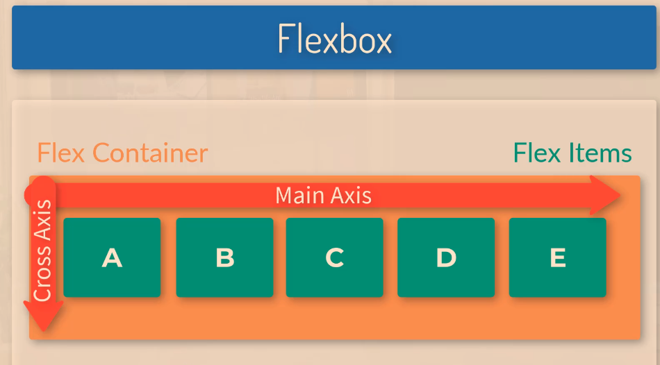
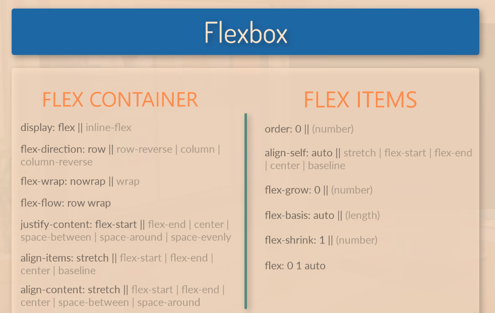
flex:1 – for each of the boxes, makes them evenly distributed in terms of their width. As all the flex items are given a value of 1, they are all the same size.
If you were to change the flex value for .box-1 to 4, then box-1 would take up four-sixths (4/6) of the page:
Change the order of Flex Items
With flexbox you can change the order of the flex-items, (the boxes) without changing the HTML.
To do this use the “order” property.
The code below will put box-1 in the second position, left to right.
Flex-direction: Column
By giving the container the flex-direction property, with a value of “column”, the boxes / flex items will stack on top of each other
Justify-Content
You can use the “justify-content” property to align the boxes within the flex container.
justify-content: flex-end; will push all the flex items to the right
Justify-content:center; will place the boxes in the centre of the container
Justify-content:space-between;
Aligns the content spaced evenly across the entire width of the container, with margins in between:
Space-around will add some “space around” the items, so that they have margins in between the items and also to the sides of the left-most and right-most items:
Flex Grow
If after the dimensions of the flex-items have been set, they leave room or space, you can use the “flex-grow” property.
If you give each flex item a flex grow value of 1, then the items will take up an equal amount of the remaining space.
It could be 1, or 100, it won’t make a difference if all the items have the same value.
Below, flex item “one”, is the only flex item with a “flex grow” property, and it therefore takes up all the space that was left over from left to right by the 3 boxes.
One of the things I’ve found a bit of a ball ache as a developing developer, is sorting out spacing i.e. padding and margin issues when creating pages using Magento.
For example, let’s say I want to change the spacing above an image.
Best thing I’ve found to do to find the margin or padding that I want to change:
Right click on image – choose Inspect Element
In the “styles” tab of dev tools, look for margin and padding styles
In this instance, it’s not the image, or the images div or container that’s causing the spacing that I don’t want:
In this instance, I click on the “Div” or container, that the image resides within (the parent element)
Now I’ve found the issue with the spacing at the top that is too large:
I can now go into the stylesheet and amend the class “content-image section” or just add an in-line style to this individual incidence of the class, and change “margin-top” to something like 15px.
When you are inspecting an element in Chrome, Dev tools will also tend to highlight (in a dark shade) the spacing around that element too, so it shows you which element is generating the padding or margin.


 Small Business Dad